Televator
Brand Identity, Strategy, Copy
"elevate your message"
Background
Televator Corporation was formed with the innovative idea of transforming idle elevator rides into an engaging, informative, and entertaining experience. Recognizing the untapped potential of this captive audience, Televator set out to revolutionize the elevator experience and create a unique, new marketplace for advertisers. Through its state-of-the-art display and content delivery system, Televator has successfully turned elevator journeys into dynamic advertising opportunities, delivering highly targeted messages to a lucrative demographic.

Objective
Creating a brand identity that would capture the essence of their unique business model. Devise a logo that would instantly communicate the company's core business - enhancing elevator experiences through the integration of digital media, while also presenting an image of innovation, reliability, and dynamism.
Design Process
Brainstorming sessions, sketching various ideas, and analyzing symbols and metaphors that best represented Televator's mission. The design needed to be simple yet meaningful, versatile and timeless. We finally arrived at the concept of using abstract lines to represent a skyscraper and an upward-moving swoosh to symbolize an elevator.
The final logo mark is comprised of 5 lines in grey that form the vertical shape of a building, reminiscent of iconic structures like the Empire State Building. Two lines at the bottom strengthen the form of the building, grounding it firmly. Overlaying this structure is a 1/4 upward moving swoosh, like the top left 1/4 of a circle. This swoosh, rendered in a distinctive Televator blue, represents the motion of an elevator, adding dynamism to the design.
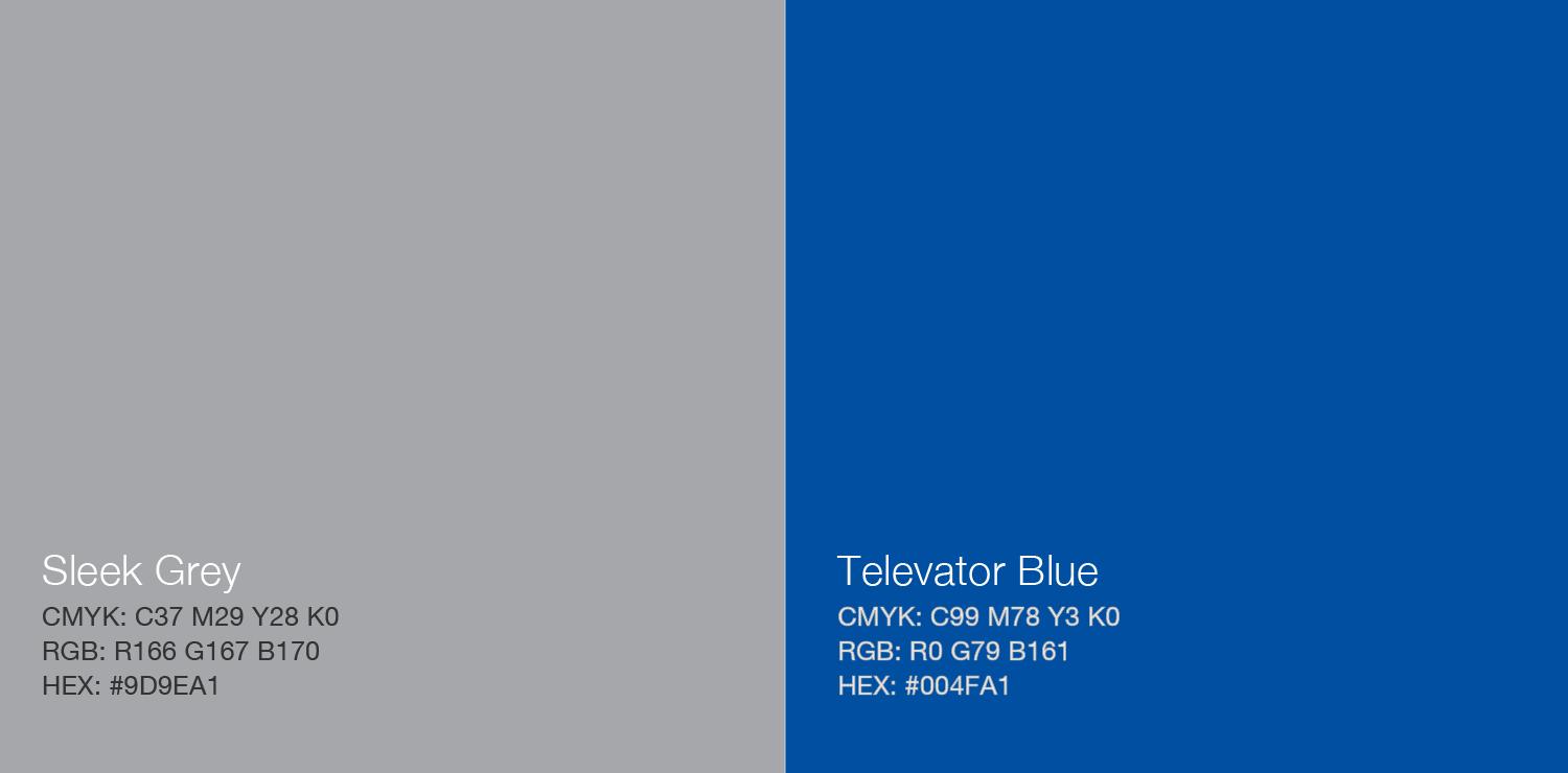
Color Palette
The color palette for Televator was chosen to convey trust, stability, and innovation.
Contrast and Harmony: The chosen colors provide striking contrast and balance within the logo while maintaining an aesthetically pleasing visual appeal.
Sleek Grey (#9D9EA1): Utilized as the primary color in the logo, this sleek grey stands for stability, trust, and reliability.
Televator Blue (#224494): This dynamic blue hue is incorporated to represent innovation, depth, and wisdom. It signifies Televator's commitment to pioneering a new frontier in the realm of elevator advertising. The vibrant blue provides a splash of energy against the sleek grey, akin to Televator's unique, vibrant contribution in a traditional advertising landscape.

Final Thoughts
The final logo successfully represents Televator's commitment to elevating the elevator experience through innovation and technology. The logo's modern and dynamic design clearly communicates forward movement and upward progress, which are key aspects of Televator's brand identity.
Along with the logo, various marketing collateral were created, maintaining a consistent brand language throughout. The dominant use of Televator blue and the prominent placement of the logo helped establish a strong visual identity.
Televator's branding, through its distinct logo and consistent visual language, has played a significant role in creating a unique identity in the market, setting it apart from competitors. The clear and compelling branding has also aided in effective communication with potential clients, partners, and investors, thereby contributing to the company's overall growth.