SeedWise
Brand Creation Concept, Web Design
"preserving biodiversity and
promoting global food security"
"One Seed at a Time"
SeedWise is creating a world-class seed vault and exchange network, focused on conserving agricultural diversity and promoting sustainable food systems. Their vast seed collection offers a safety net against plant species loss due to climate change or disease. Committed to innovation and environmental care, SeedWise works to build a resilient agricultural ecosystem capable of overcoming climate change, disease, and food scarcity. Their mission: nurturing a lush, diverse future, one seed at a time.
Objective
Design a logo encapsulating SeedWise's mission of preserving agricultural biodiversity and promoting sustainable food systems. The design themes were security, growth, and sustainability. The target audience comprised farmers and producers who prioritize biodiversity and sustainability, researchers and organizations working on agricultural preservation and climate-resilient crops, and consumers demanding transparency and ethics in food production."

Design Elements
The logo integrates a pill seed shape, reflecting SeedWise's dedication to seed preservation. A lock outline symbolizes the protection provided to diverse seeds. A sun, representing life and energy, is positioned at the top, while six lines beneath it hint at a field, underscoring the commitment to sustainable agriculture.
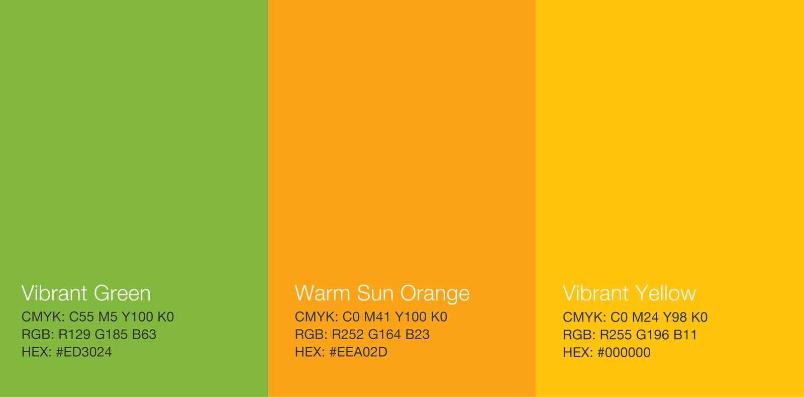
Color Palette
The color palette, chosen for its resonance with growth, nature, and sustainability, ensures contrast and harmony within the logo, enhancing its visual appeal
Vibrant Green (#81B93F): Utilize vibrant green as the primary color in the logo, representing growth, sustainability, and the connection to nature that is central to SeedWise's mission.
Warm Oranges (#EEA02D and #F4C12F): Incorporate these two warm orange hues to evoke feelings of warmth, energy, and sunlight, essential for crop growth and agricultural success.
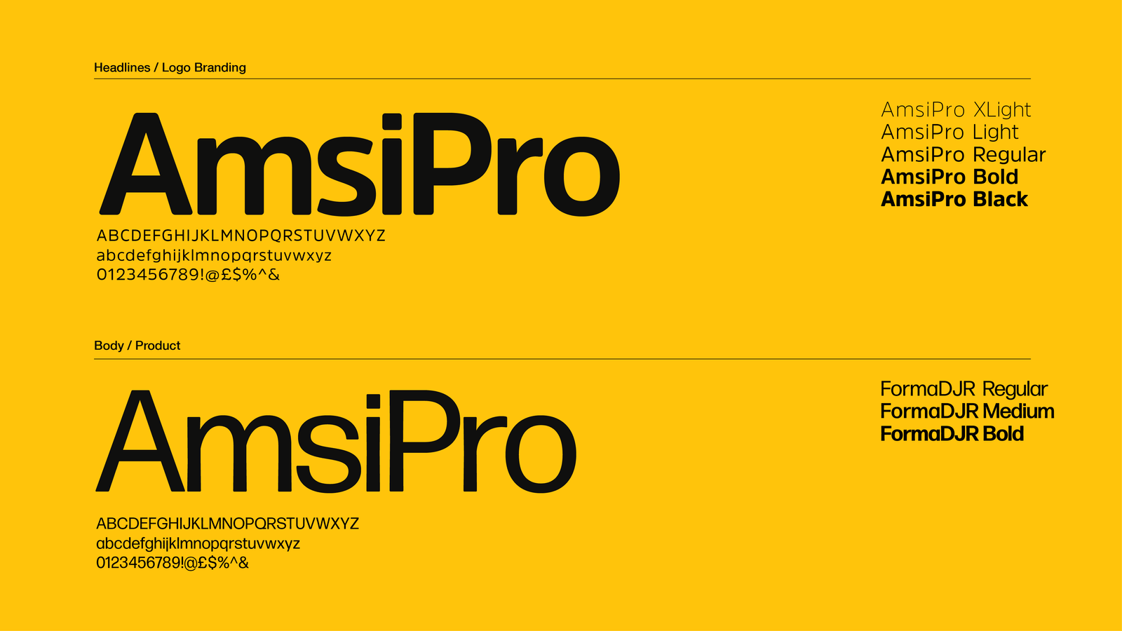
Typography
AmsiPro-Black, a clean and modern typeface, was used for the company name to emphasize SeedWise's innovative approach to agriculture, ensuring legibility across sizes and mediums
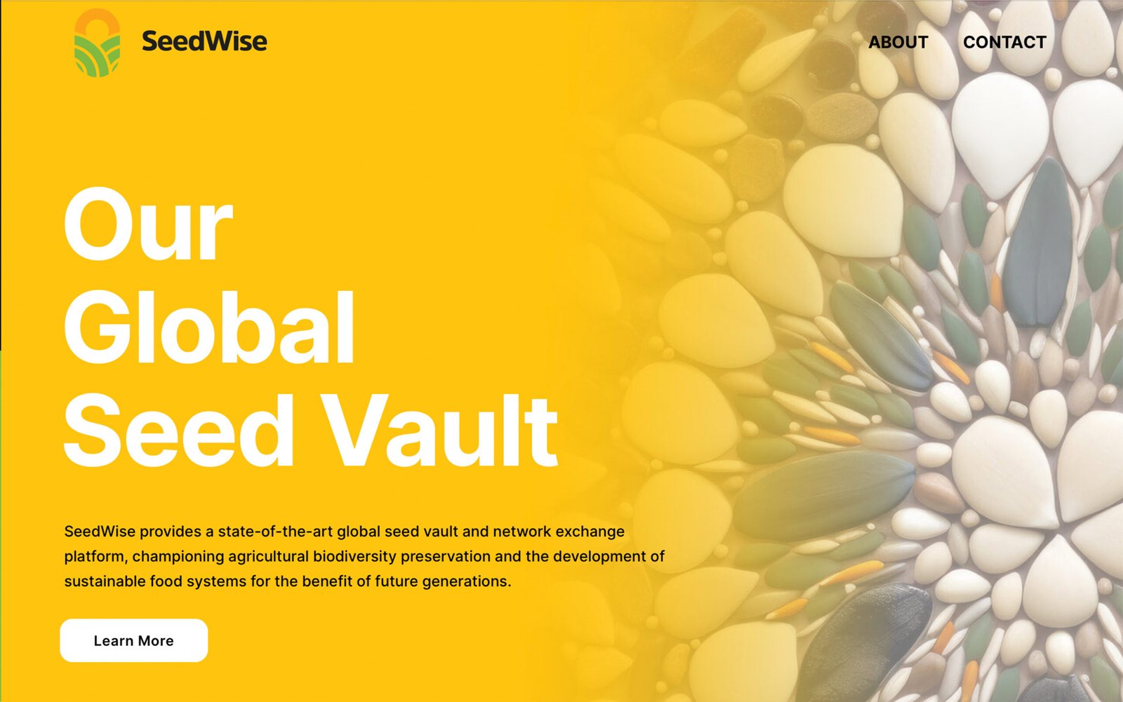
Website Design
Through a clean, user-friendly design, the SeedWise website effectively communicates the organization's mission and work. The design prioritizes ease of navigation and clarity of information, reflecting the practical, forward-thinking ethos of SeedWise.