OPTICKS
Facsimile Reproduction Reprint
: or, A Treatise of the Reflexions, Refractions, Inflexions and Colours of Light
Background
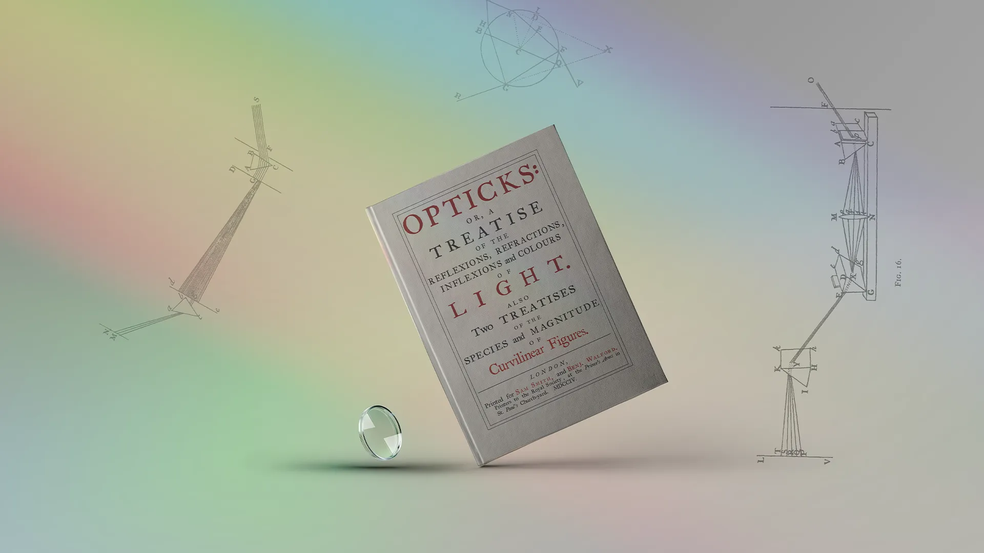
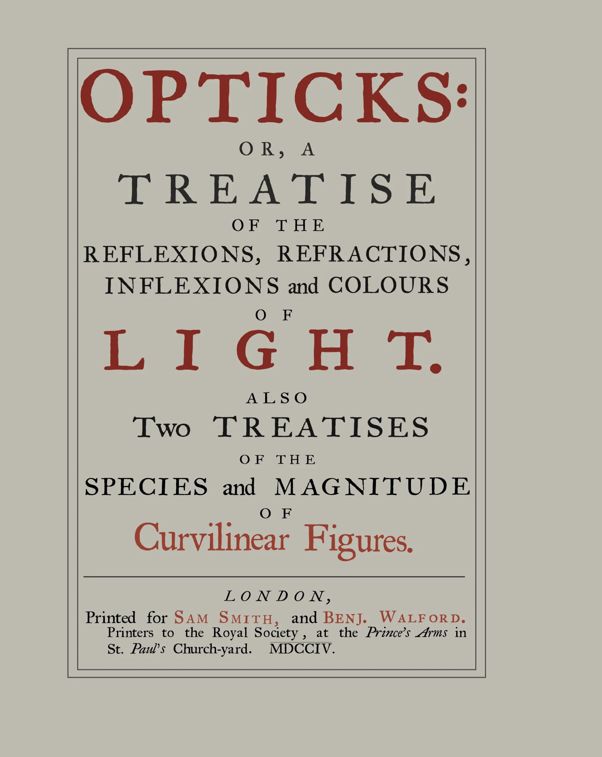
This facsimile project was focused on recreating the cover of Isaac Newton’s Opticks from 1704. Newton’s work laid the foundation for modern color theory, shaping the way we approach color in design today.
Context
Before Opticks, people didn’t fully understand how color worked. Newton showed that light itself contains color, and his experiments with prisms proved that white light is actually a combination of all the colors in the visible spectrum. This was a huge shift in thinking. Newton’s discoveries still influence the way we use color in both digital and print media.
For this cover, I wanted to maintain the historical feel of the original, but with more precise, modern adjustments. The original printing had quirks...uneven inking and slightly off-center alignment, but I wanted this version to feel cleaner and more balanced without losing its connection to that era.
BEFORE AND AFTER
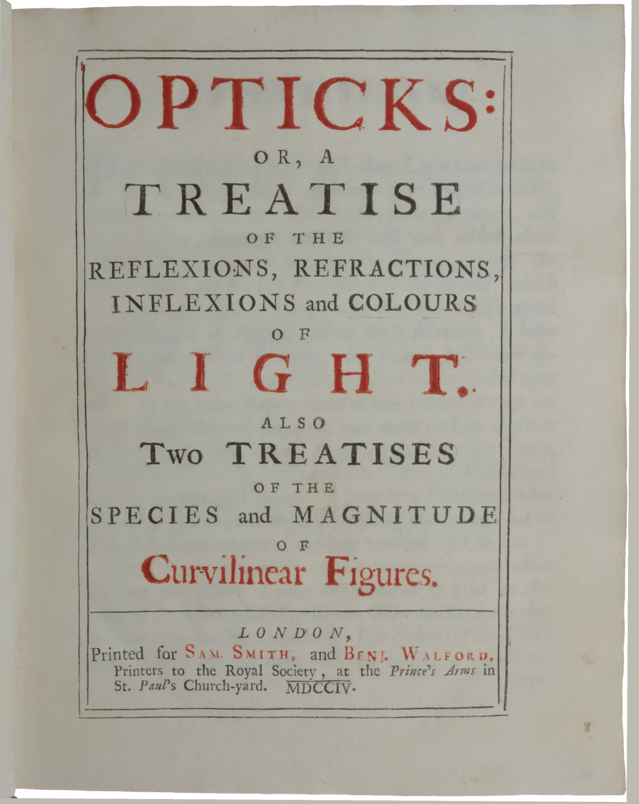
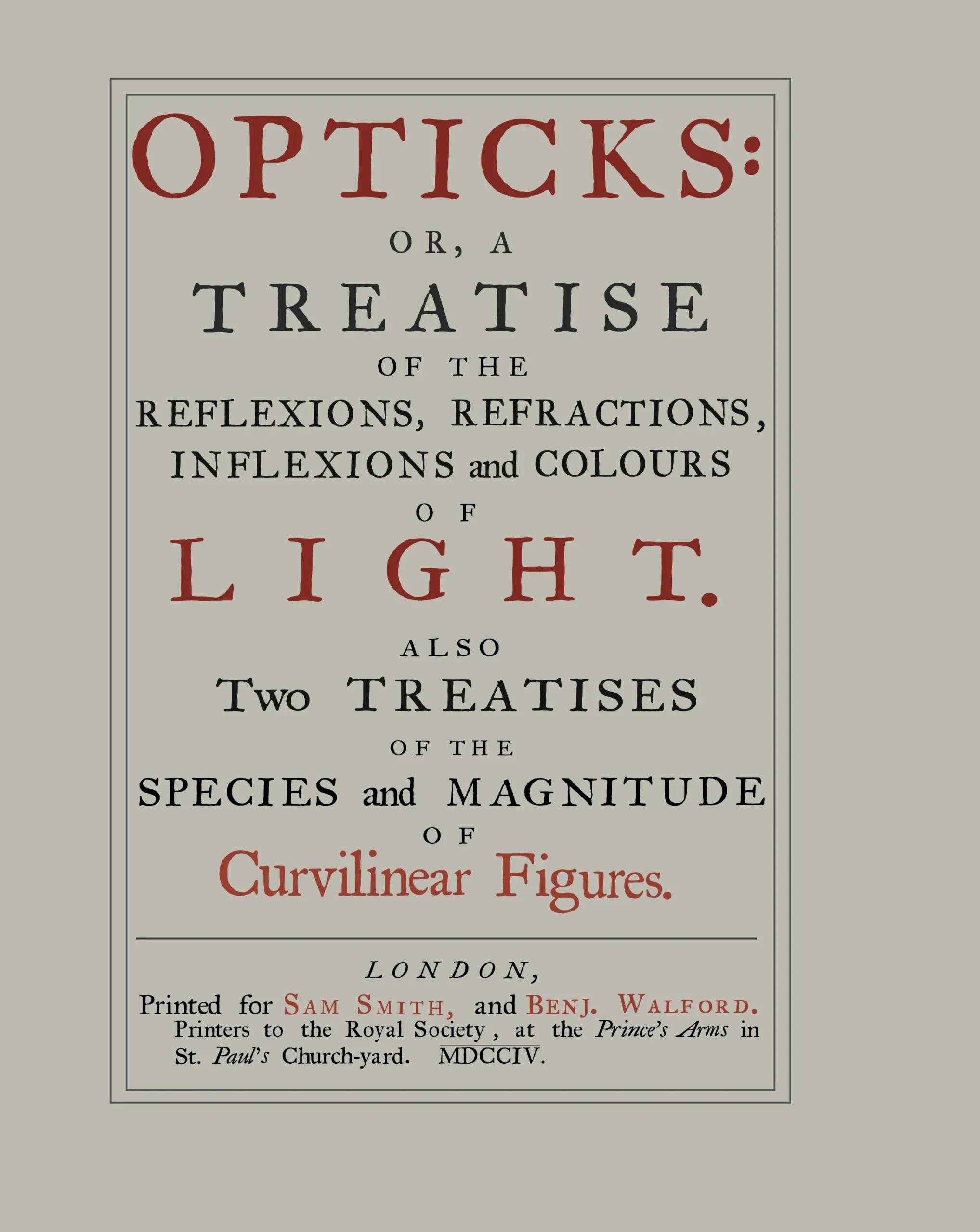
Typeface and Design Adjustments
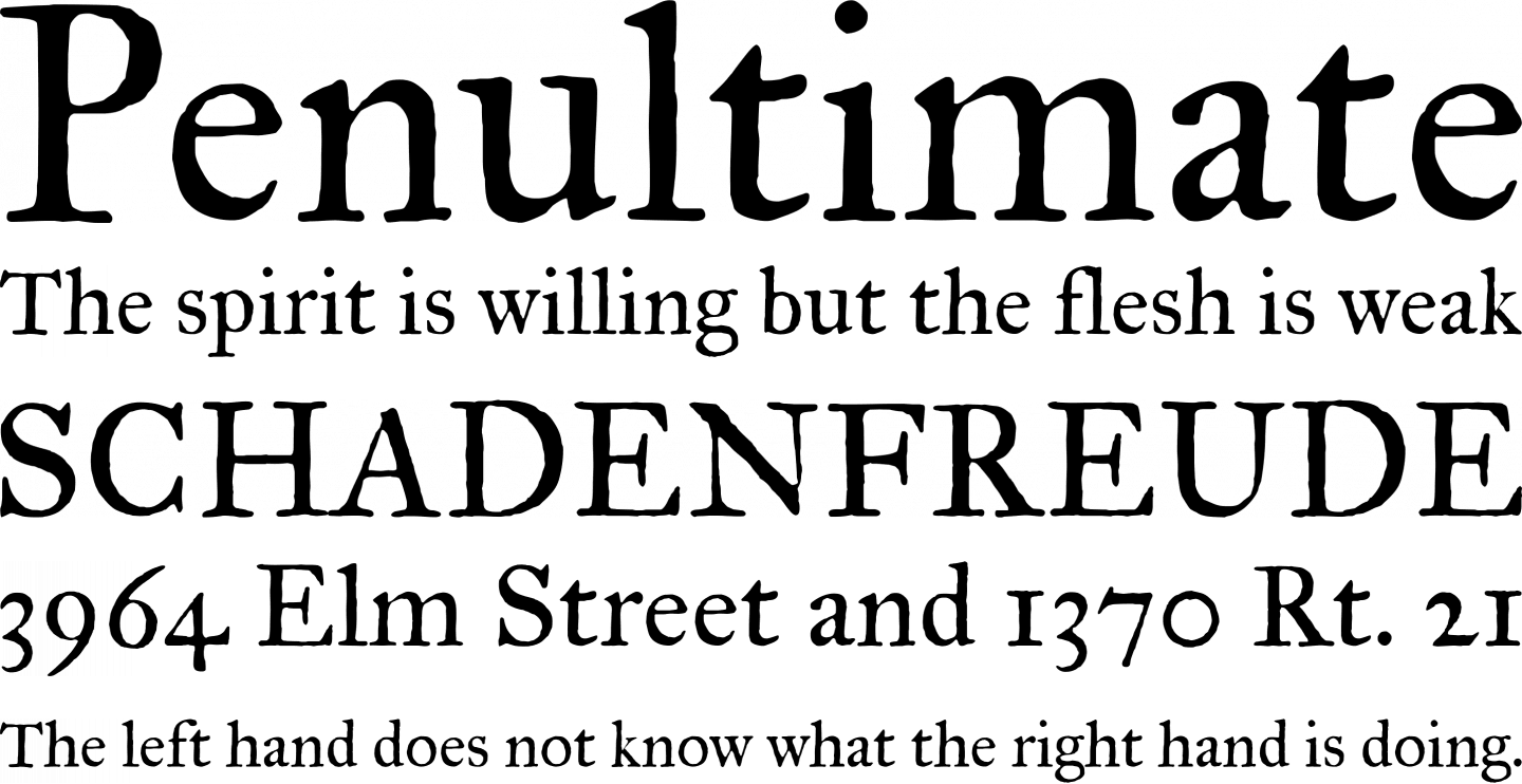
I used IM Fell Great Primer, a revival of the Fell Types from the late 17th century, which aligns closely with the time of Newton’s Opticks. The typeface has a distinctive texture with bracketed serifs and strong contrasts in stroke weight. It maintains the rugged, historical character of the original printing but allowed for precise adjustments where needed.
It’s important to recognize that while the original Opticks was printed in London, the typesetters, Smith and Benj. Walford, (Printers to the Royal Society), may not have necessarily used the Fell Types. The availability of different typefaces and printing styles in London at that time suggests they might have opted for alternative serif types that reflected local printing traditions.
IM Fell Great Primer was designed by Igino Marini. He revived the original Fell Types, which were originally commissioned by John Fell, the Bishop of Oxford, in the late 17th century. Marini’s work in restoring these typefaces has brought historical fonts back into the modern design world while maintaining their authenticity.
Boldness
In the original, the words “OPTICKS,” “LIGHT,” and “Curvilinear Figures” appeared bolder than the rest of the text. This effect likely came from the natural variability of letterpress printing, where certain areas received more ink or pressure, resulting in a heavier appearance. The printers would not have used a different typeface, but the uneven inking gave the text a distinct weight. Rather than trying to replicate those imperfections, I adjusted the weight of these words in my design to maintain their prominence without losing clarity.
Layout and Alignment
The original cover had an uneven alignment, typical of the hand-set type of the time. The right margin was slightly larger than the left. I kept that feeling.
Color and Printing Choices
The original Opticks cover was printed using red and black ink, a typical choice for important publications at the time. I kept this two-color scheme but opted for a more muted red, reflecting the natural pigments that would have been used in the 1700s. In that era, red ink was often made from pigments like vermilion, derived from ground cinnabar, or red ochre, which produced earthy tones. These pigments were mixed with oil-based binders like linseed oil to create the ink. Vermilion, with its bright and vivid hue, was commonly reserved for high-profile works due to its cost and intensity, while red ochre offered a subtler, less expensive alternative.
Conclusion
This facsimile keeps the spirit of the original Opticks cover intact while making it cleaner and more precise. Using a historically (semi) accurate typeface, I adjusted a few details in the letterforms and centered the layout to give it a polished look.
