ODYSSEY
Concept, Brand Identity, Strategy, Web, Copy
"The Current of Adventure"
Background
Objective
The objective was to craft a logo that encapsulates the essence of Odyssey - a brand leading the electric revolution with advanced battery technology and customizable platform. The design themes were power, sustainability, and customization.
The target audience included:
- Enthusiasts and riders seeking a high-performance, eco-friendly alternative to traditional motorcycles.
- Environmental advocates focusing on sustainability and carbon footprint reduction.
- Consumers valuing bespoke design, seeking a unique and personalized riding experience.
Design Elements
The design elements of the logo unite to convey Odyssey's dedication to powerful, sustainable, and highly customizable electric motorcycles.
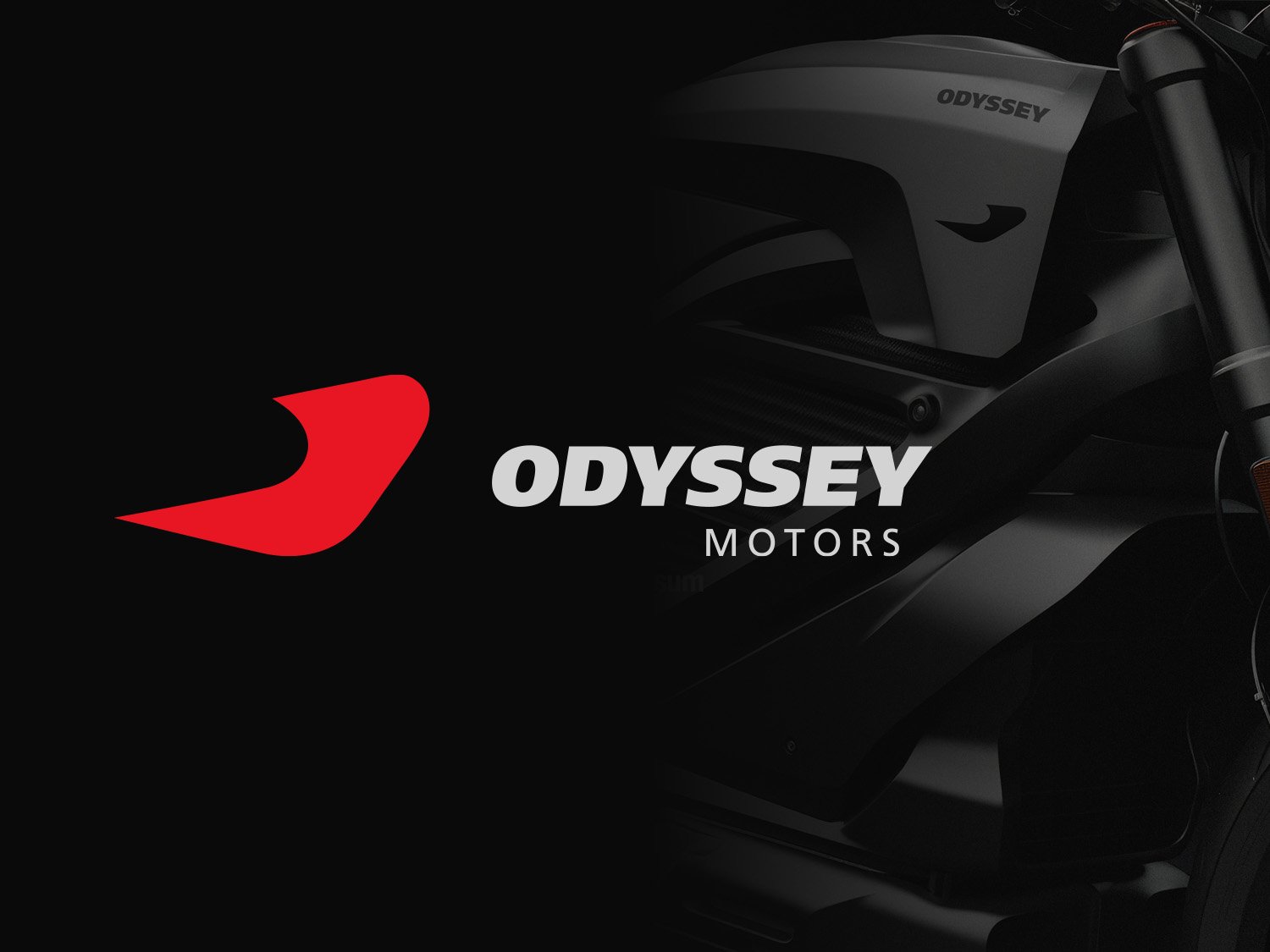
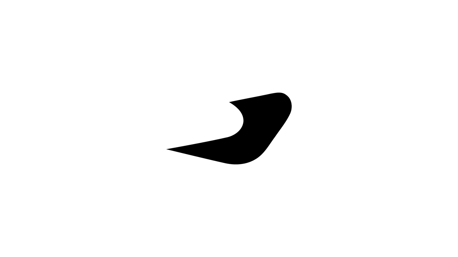
Logo Mark: The logo embodies an abstract representation of the front of a motorcycle body, symbolizing the central focus of Odyssey - motorcycles. The forward-moving swoosh, in Odyssey Red, signifies power, speed, and the brand's progressive approach to electric mobility.
Logotype: The brand name, "ODYSSEY," with "MOTORS" underneath, uses the AG Foreigner font. The choice of typeface represents the modern, innovative, and dynamic nature of Odyssey, while maintaining a sense of solidity and reliability.
Color: The dominant color, Odyssey Red, communicates energy, passion, and the brand's commitment to creating thrilling riding experiences. The deep blue hue of the text, a contrast to the red, resonates with stability, trust, and the sustainable ethos at the heart of the brand.
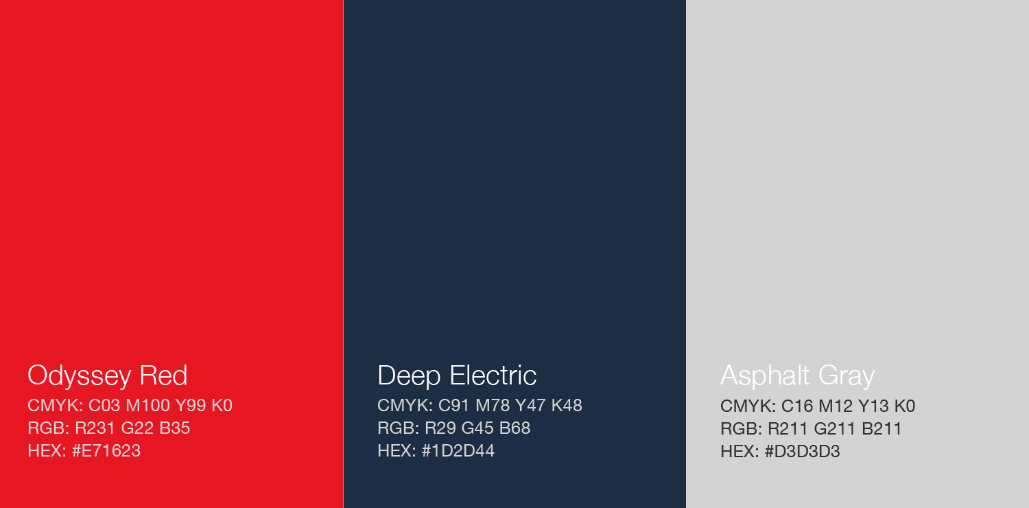
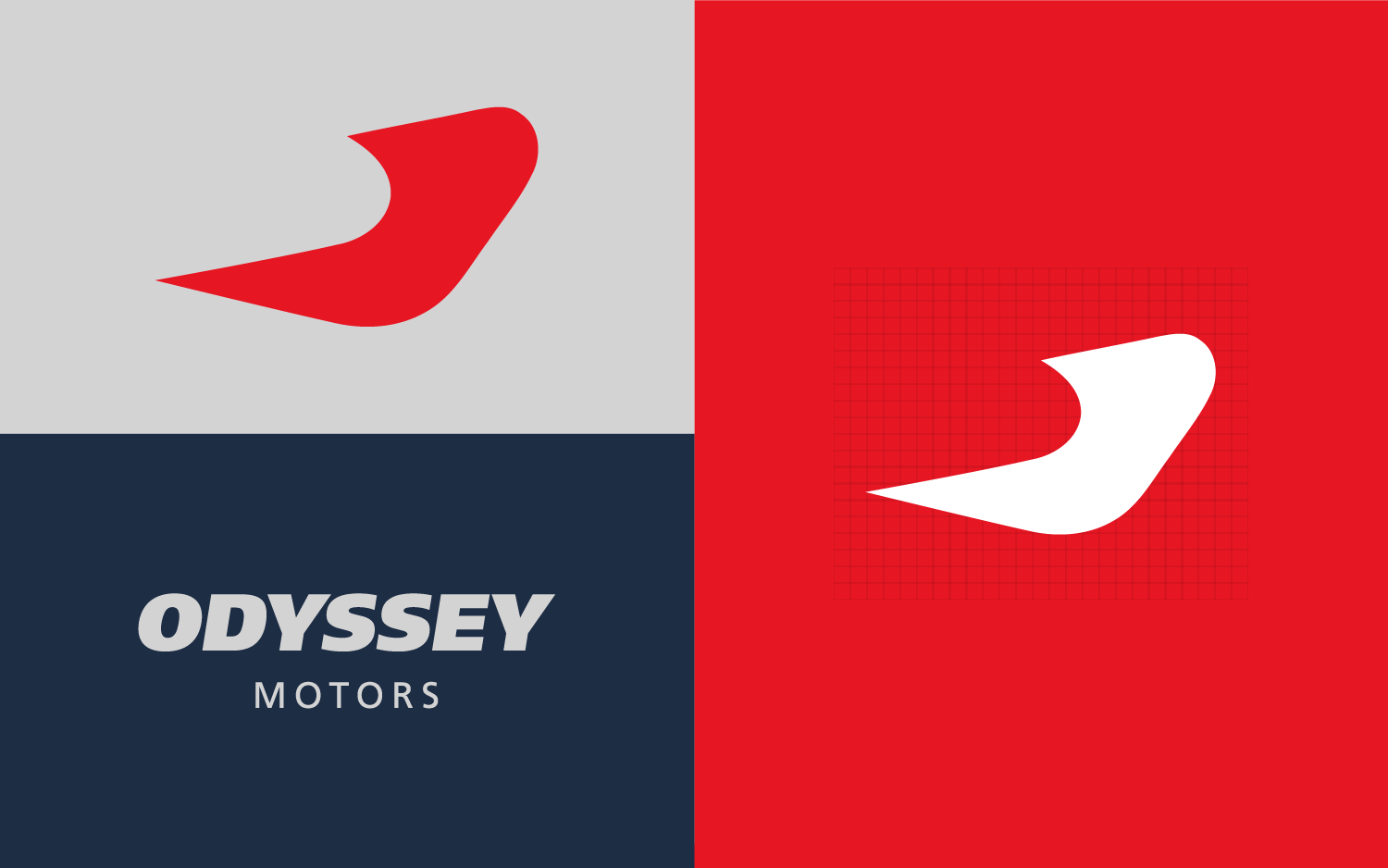
Color Palette
The color palette for Odyssey was chosen to inspire feelings of energy, innovation, and stability. Each tone was selected to align with the brand's themes and ethos.
Contrast and Harmony: The palette was curated to ensure sufficient contrast between design elements, while also maintaining visual appeal and thematic consistency within the logo.
Odyssey Red (#E71623): The primary color in the logo, this vibrant red represents the brand's passion, energy, and commitment to creating thrilling, high-performance electric motorcycles.
Deep Electric (#1D2D44): This deep blue hue was incorporated to evoke feelings of trust, stability, and depth, mirroring the brand's dedication to sustainable innovation and reliable performance.
Asphalt Gray (#D3D3D3): This neutral gray signifies the brand's connection to the open road. It also provides a balanced contrast to the vibrant red and deep blue, grounding the design and tying into the tangible, tactile experience of riding.
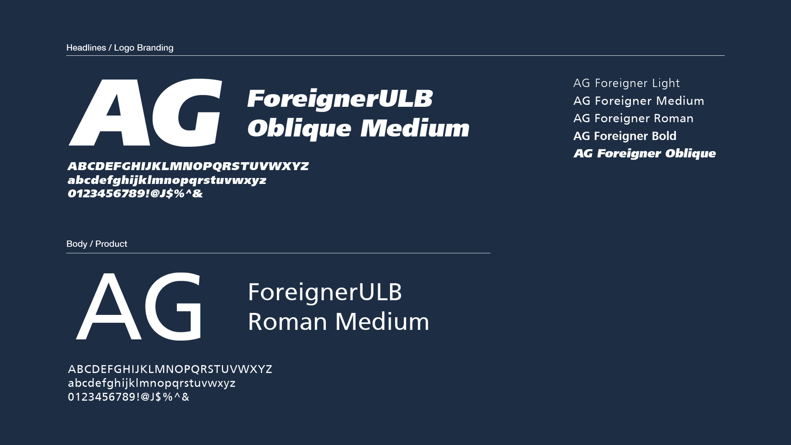
Typography
The typography for Odyssey was selected to reflect the brand's innovative and dynamic spirit while ensuring readability across various sizes and mediums.
Dynamic and Modern: AG ForeignerULB Oblique Medium, a modern and clean typeface, was chosen for the company name - ODYSSEY. All caps and sheared forward, the typography mimics the sensation of movement and speed, embodying the thrilling experience of riding an Odyssey motorcycle.
Balance and Breathability: Underneath the brand name, the word 'MOTORS' is also presented in all caps but in a smaller font size. It's kerned out to provide balance, maintain readability, and allow the design to breathe, reinforcing the brand's attention to detail and quality.
Application
The Odyssey logo has been designed to provide flexibility and adaptability across various applications. The logo, a cohesive lockup, can be effectively used in both vertical and horizontal formats, depending on the design context and requirements.
The logo mark, an abstract representation of the front of a motorcycle with a forward-moving swoosh, stands strong on its own. This powerful symbol can be used independently, serving as a visually compelling representation of the Odyssey brand in contexts where space is limited or where instant recognition is essential.
Similarly, the logotype, featuring the brand name 'ODYSSEY' and 'MOTORS' underneath, has been designed with distinctiveness and readability in mind. Even without the logo mark, the logotype can be effectively used independently, offering a clear, bold statement of the brand name.
This flexibility allows for consistent brand recognition and versatility across various applications, from digital platforms to physical products and marketing materials.
Web Development
The development of the Odyssey website is focused on creating a consistent brand identity across the user experience. That includes working with back-end developers to create design elements to accompany a seamless, bespoke customization platform.