Musère
Wordpress Dev, Brand Identity
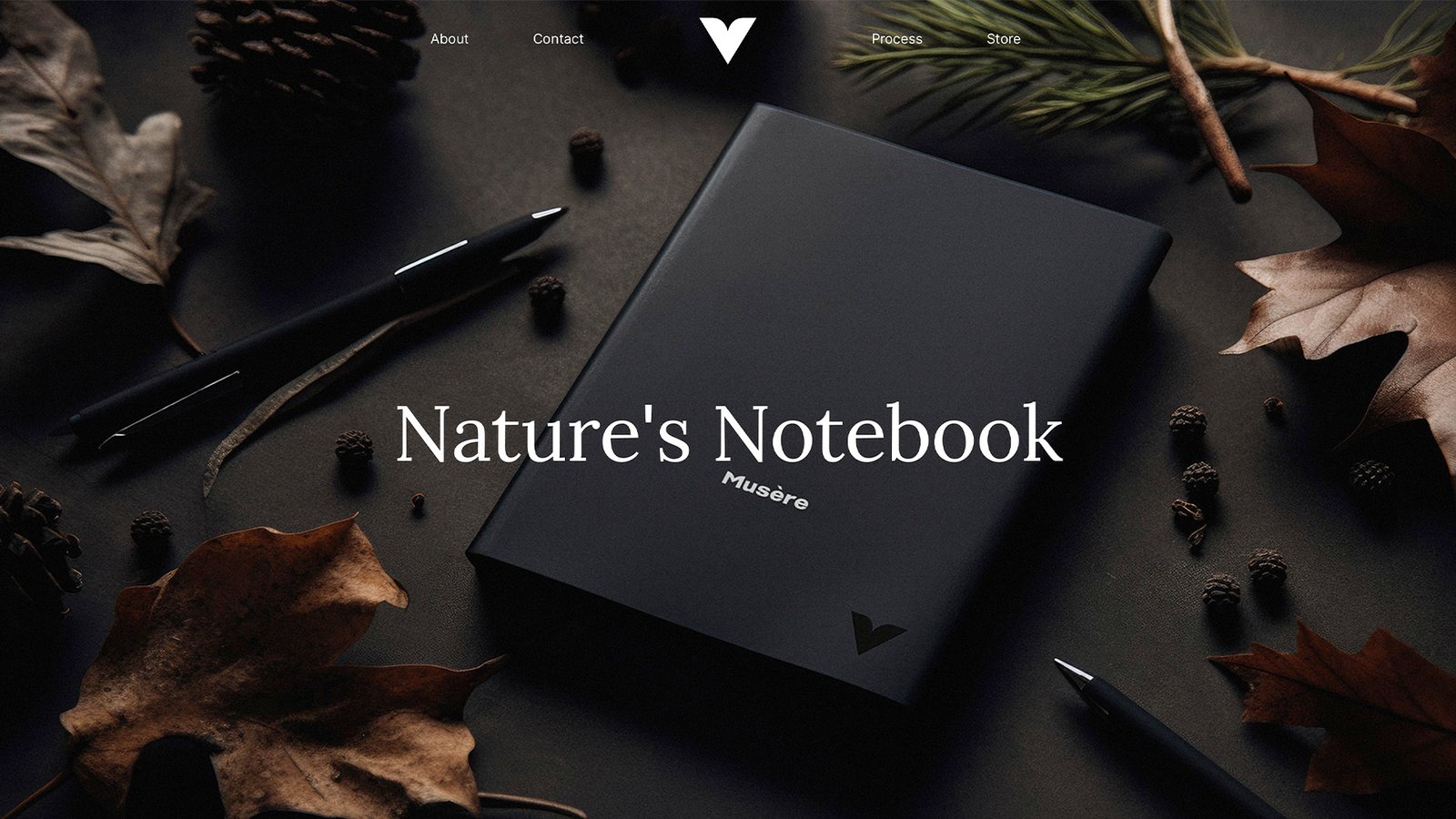
"Nature's Notebook"
Objective
A fast-track branding and communications design challenge. In an afternoon, a distinctive concept, name, brand identity, imagery, website, and copy.
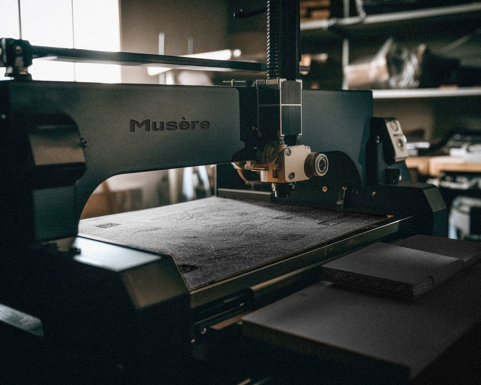
Seeing a void in the market for eco-friendly notebooks, I explored several materials, ultimately favoring mushroom-based leather (Mylo) for its sustainable and durable qualities. Hence, 'Musère', a blend of 'muse' and 'serenity', was born, encapsulating artistic expression and environmental protection.
site: www.musere.com
The Challenge
As a new player, Musère needed to distinguish itself from established notebook brands by developing a unique and memorable identity. The challenge was to create a brand that reflected the company's core values and resonated with environmentally conscious and creative consumers. The logo needed to represent a fusion of confidence, boldness, creativity and sustainability, appealing to an eco-conscious artistic audience. Additionally, it had to be versatile enough to work well on both digital and print mediums, ensuring consistent brand recognition in various contexts. A bold mark could be placed on even the smallest medium. A logotype to serve the introduction to the brand.
The Solution
The Mark: The Musère logomark features a bold pencil/pen tip with a distinctive "M" shape, representing a fusion of creativity and precision. The shape of the mark embodies the essence of the brand and reflects its mission to inspire artistic expression.
The Lockup: A startup like this doesn't have brand equity, so it's always best to begin with a lockup. Only when significant equity is established can the logotype be used more infrequently. For now, the mark and logotype work in tandem, creating a cohesive visual identity.
The logotype was born from the foundations of Outer Sans, gradually evolving into a unique, customized typeface. The letter "M" mirrors the stylings of the mark, ensuring consistency across the brand. The mark and logotype each play a distinct role, adapting to various mediums.
Musère's color palette embraces a minimalist, monochromatic scheme that exudes an air of self-assured simplicity. This straightforward choice reinforces the brand's identity, reflecting creativity, sustainability, and timeless elegance.
Brand Implementation
Launching with "Nature's Notebook," we'll spotlight Musère's unique features through visuals and storytelling. By maintaining multi-channel messaging across web, social media, and promotional materials, we'll ensure a compelling brand entry. The notebooks, crafted from the eco-friendly Mylo, embody a commitment to sustainability and style. Future campaigns will include an Artisan Series and Collaborative Collection.
Impact
Resonating with those valuing innovation and sustainability, Musère's Nature's Notebook aims to attract eco-conscious and creative consumers. A favorable reception could carve out a niche in the competitive notebook market, bolstering Musère's presence
Web Development
The website (created with WordPress) emphasizes sustainability and consistent branding to reinforce identity. The copy unfolds Musère's story, highlighting a unique product, process, and eco-friendly material. The focus on user experience meant optimization for all devices, swift load times, and clear CTAs.