Meridian Wealth
Brand Identity
"empowering futures, enriching lives"

Objective
Meridian Wealth Partners recognized the need for a fresh and impactful visual identity.
Challenge
Meridian Wealth Partners required a strong, modern, and visually striking brand identity that would resonate with their target audience and communicate their dedication to guiding clients towards a prosperous financial future. The challenge was to develop a unique logo and visual language that would encapsulate the essence of the company while remaining versatile across various platforms.
Solution
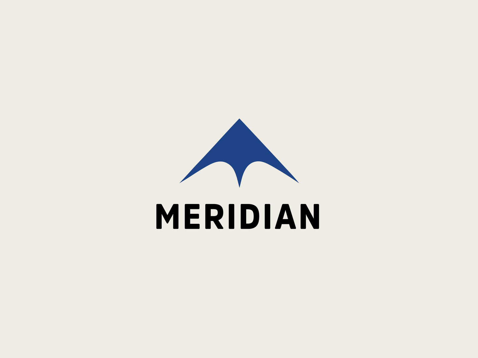
The lockup features a bold arrow pointing upward, symbolizing progress, growth, and ambition. The bottom of the triangle forms an abstract 'M,' seamlessly integrating the company's initial into the design. This visual representation of Meridian's commitment to financial success is both distinctive and memorable. Like Paula Scher is known for saying, "You should be able to draw a logo with a stick in the sand."
To complement the lockup, the AmsiPro typeface for the company name, "MERIDIAN" was chosen. This all-caps, modern sans-serif font conveys strength, stability, and forward-thinking, reinforcing the brand's promise to help clients navigate the complexities of wealth management and investment.
