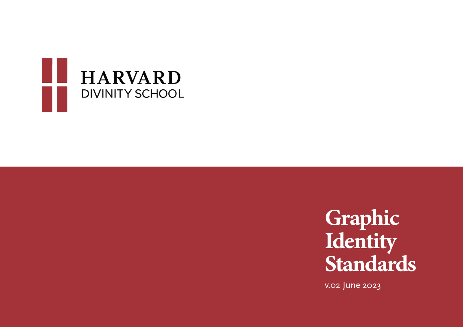
Harvard Divinity School
Conceptual, Brand Identity, Copy, Print
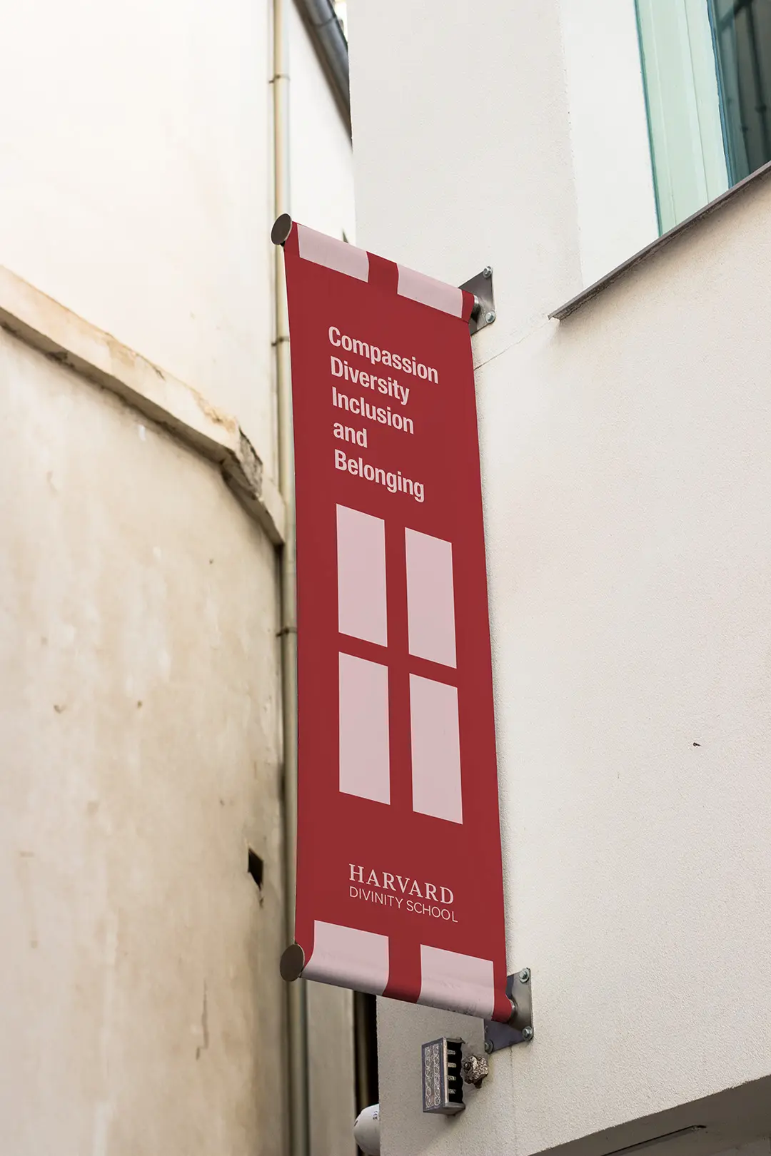
Compassion, Diversity, Inclusion, and Belonging
Background
Harvard Divinity School, founded in 1816, is a nonsectarian theological school and the second professional school established at Harvard. With a long history of intellectual inquiry, religious literacy, and engagement with diverse religious traditions, the institution remains dedicated to preparing individuals for professional ministry, service professions, and leadership in various fields enriched by religious and theological studies.
Current logo
The Challenge
The current logo for the Harvard Divinity School felt outdated and no longer aligned with the school’s modern commitments. The challenge was to create a lockup that honored its deep history but felt fresh and relevant to today’s audience. The goal was to craft a clean, cohesive visual identity that could boost the school’s visibility across all platforms, earning the appreciation of faculty, students, and alumni.
The Solution
Logo: A symbol reflecting a window into Compassion, Diversity, Inclusion, and Belonging
The new logomark, featuring a rectangle split into four quadrants, symbolizing a window, was designed to represent the core values of Compassion, Diversity, Inclusion, and Belonging. The negative space within the quadrants forms the intersection of a cross, symbolizing the institution's commitment to exploring and understanding the world's religious traditions. The familiar bold serif font, representing Harvard's tradition and prestige, was retained for the school's name. Together, these elements create a visually striking logo that captures the essence of Harvard Divinity School's mission and values.
The color palette was kept simple, using the iconic Harvard Crimson.
Brand Implementation
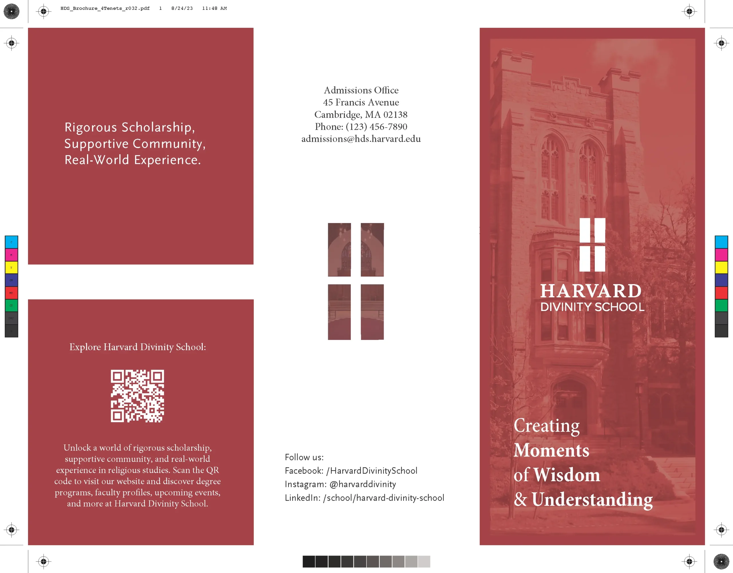
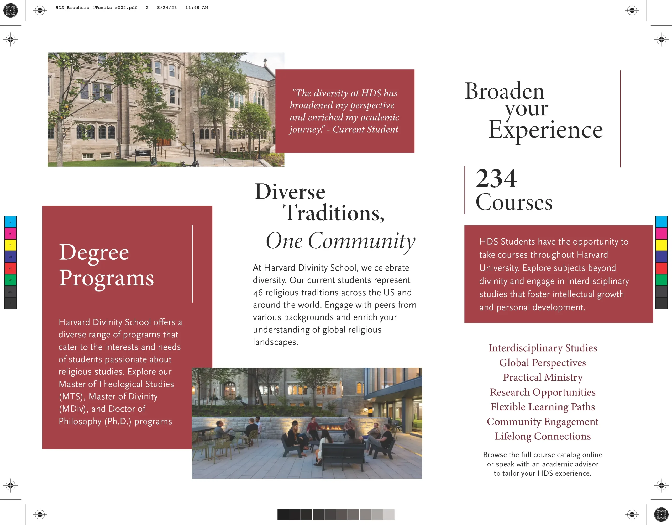
Brand guidelines and assets were developed, standardizing the usage across all touchpoints, from print materials and campus signage to digital media and social platforms. The new logo was designed to be versatile and adaptable, making it suitable for a wide range of applications.

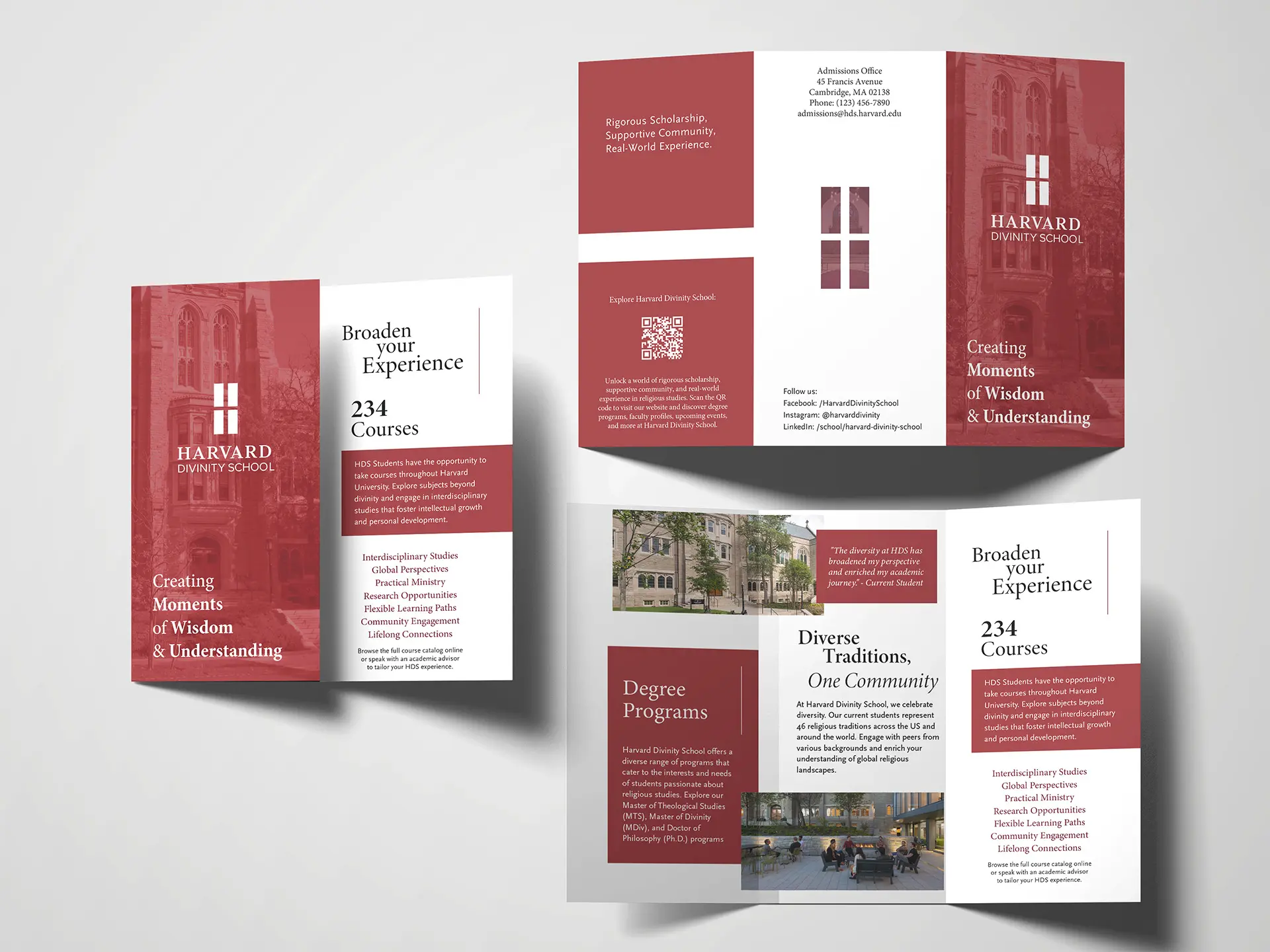
Tri-fold Brochure Mockup
Thoughts
The conceptual redesign of the Harvard Divinity School logo lends to a more modern and versatile aesthetic that can increase the school's visibility and recognition across all mediums within the academic community and beyond. Faculty, students, and alumni alike can appreciate its simplicity and ability to convey the essence of the institution while respecting its rich history.