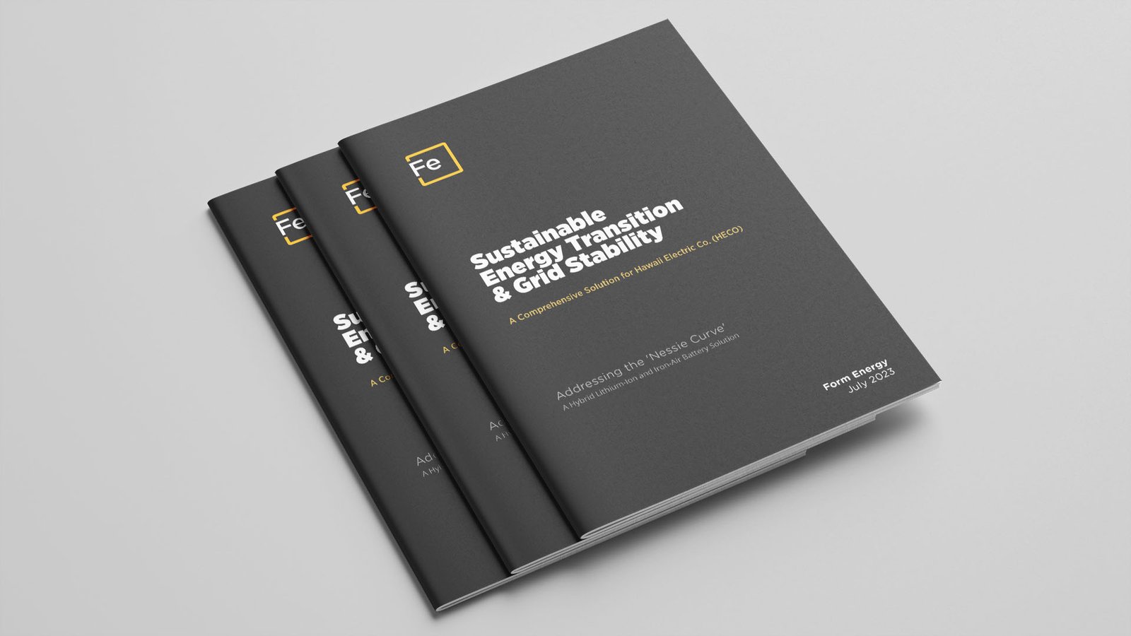
Form Energy
Independent exploration of visual identity and brand guidelines
"Humanity, Excellence, Creativity"
This work is unaffiliated with Form Energy and was developed independently as a typographic study and brand refinement exercise.
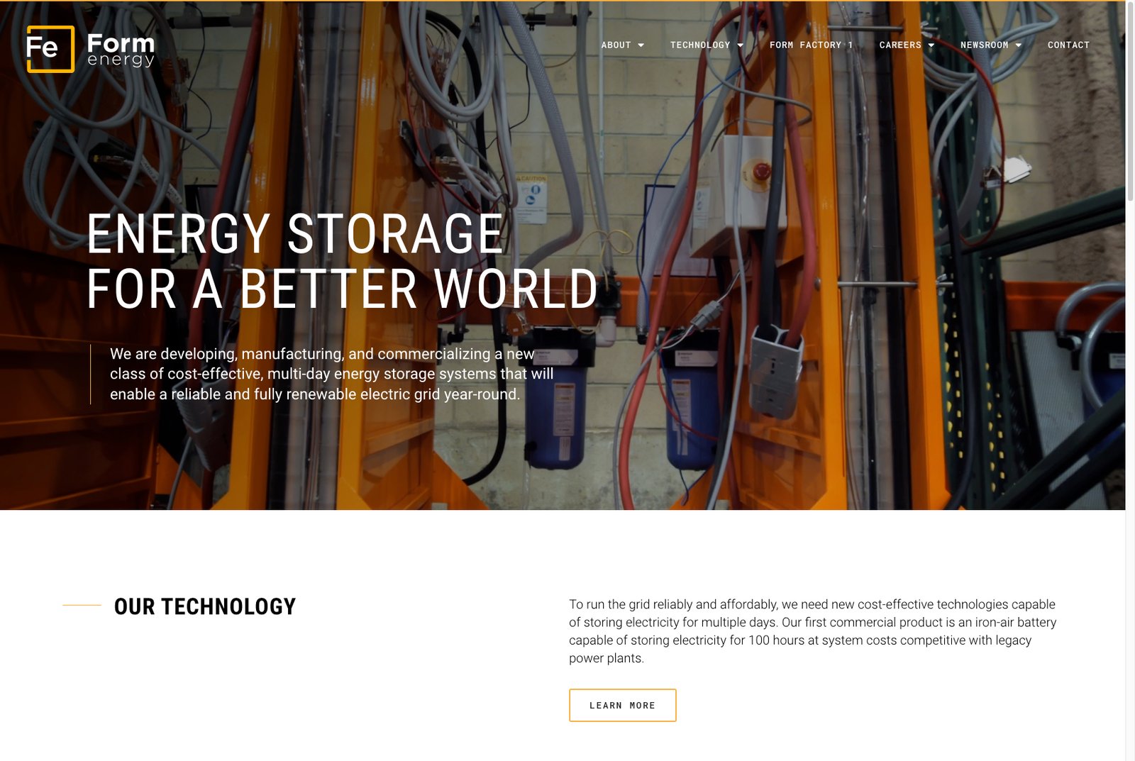
Before
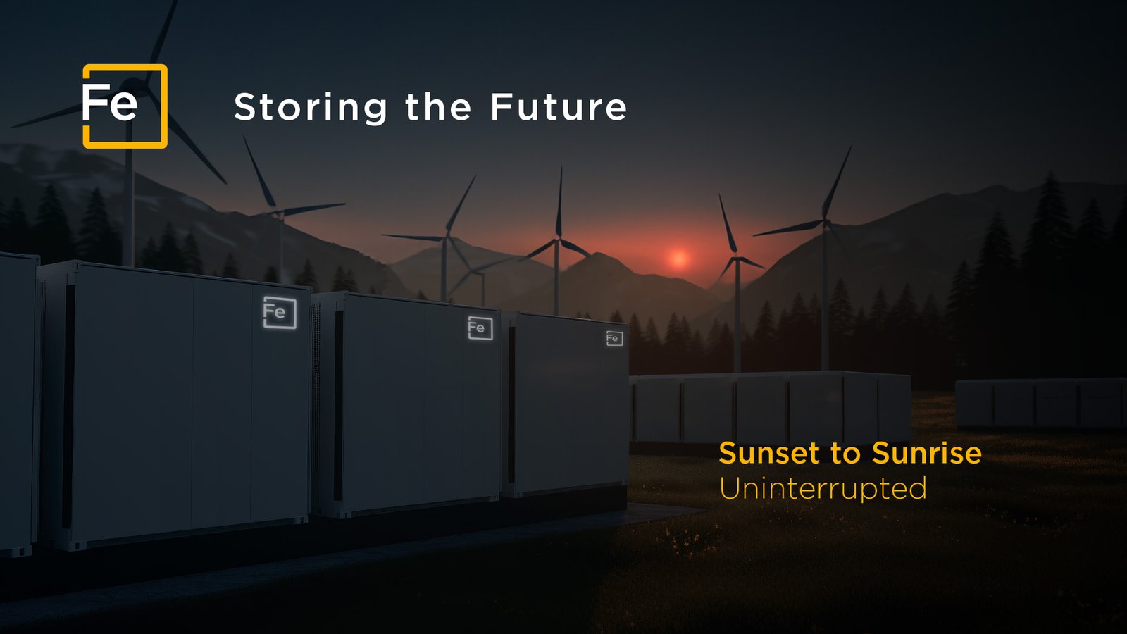
After
Form Energy: Conceptual Identity Refinement
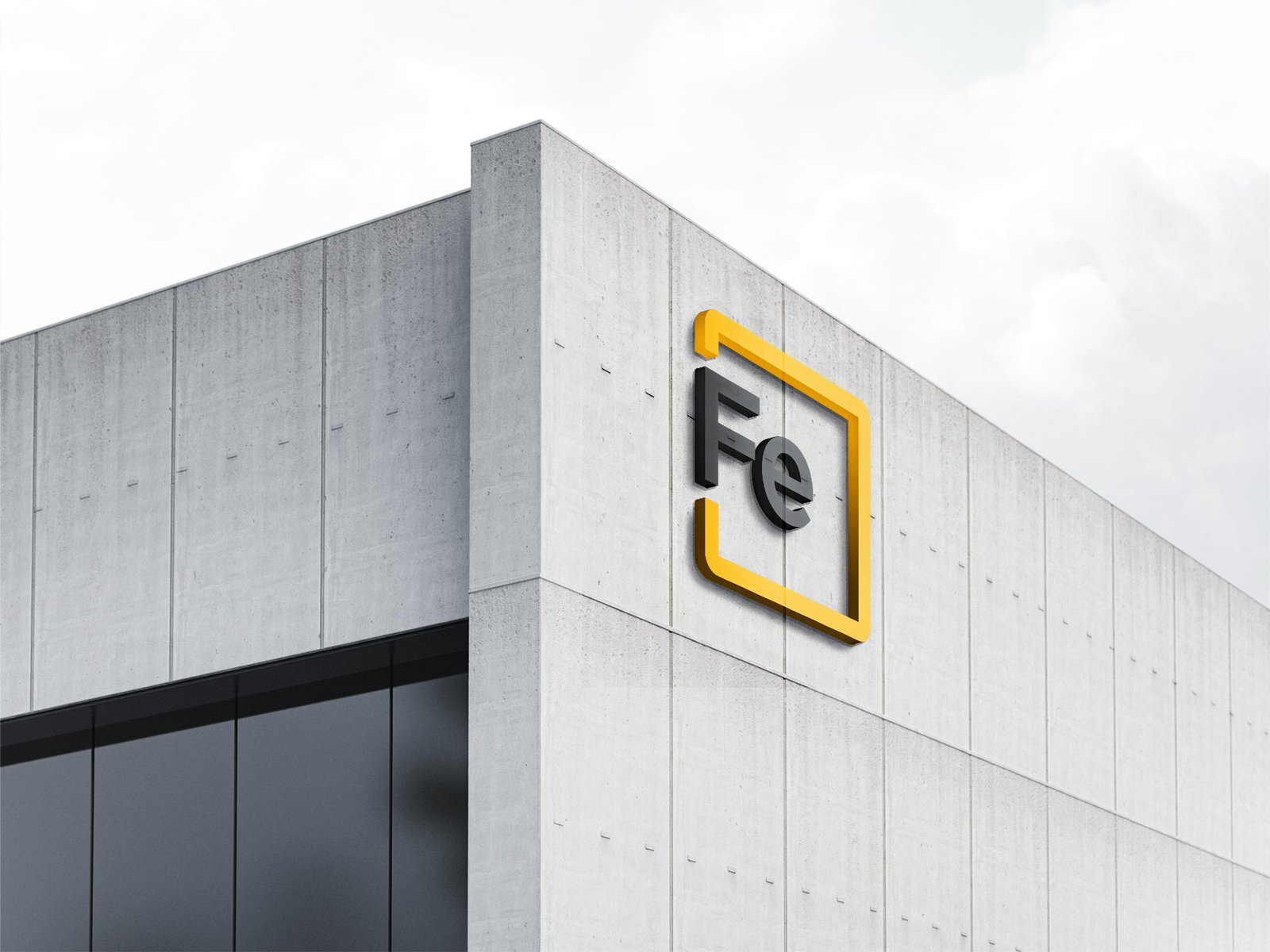
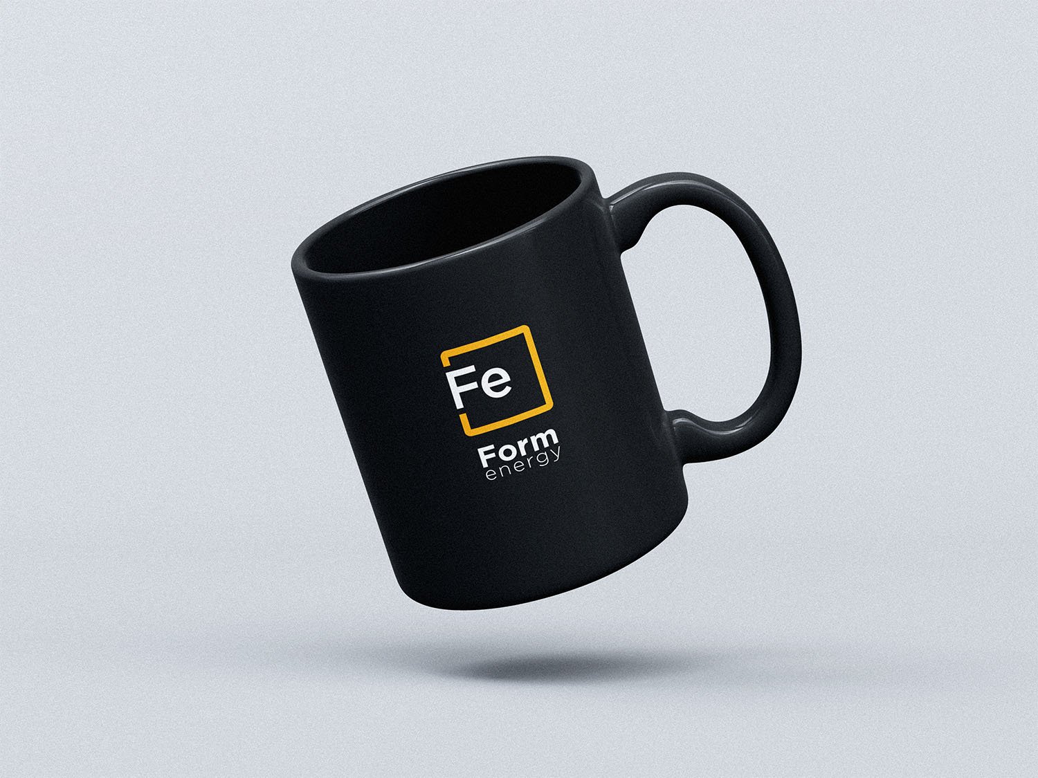
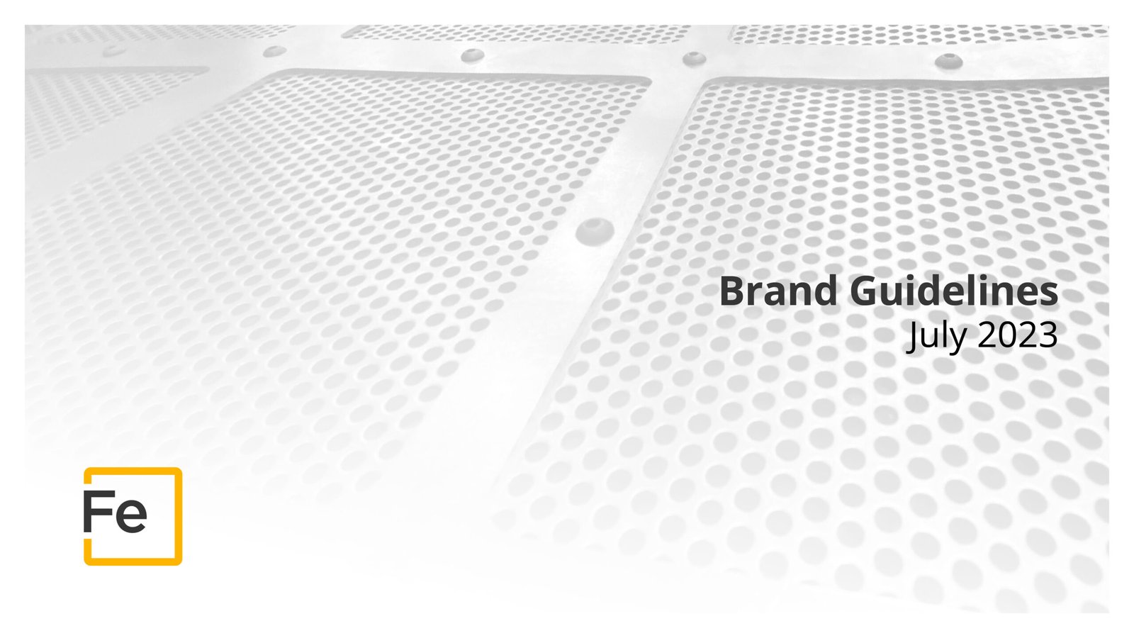
Form Energy’s visual identity draws from elemental chemistry, specifically, the periodic symbol for iron (“Fe”), but the current execution lacks structural balance. The original mark is thin, left-biased, and inconsistent in typographic form. Its lightness undercuts the material strength the company represents.
This redesign preserves the core concept but resolves its structural issues. Letterform weight is rebalanced to match the stroke of the bounding box. Proportions are optically centered. Alignment and curve logic have been tightened. The result is a more grounded, legible, and scalable mark, one that reflects both Form Energy’s materials and its mission.
Color Palette
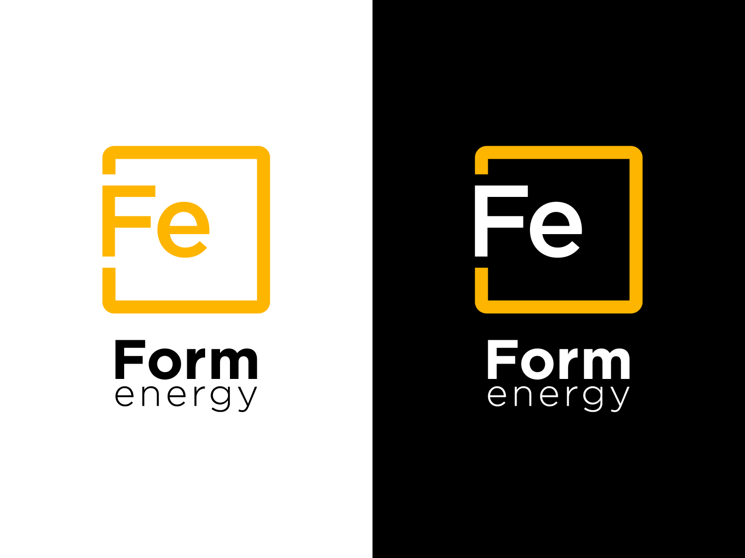
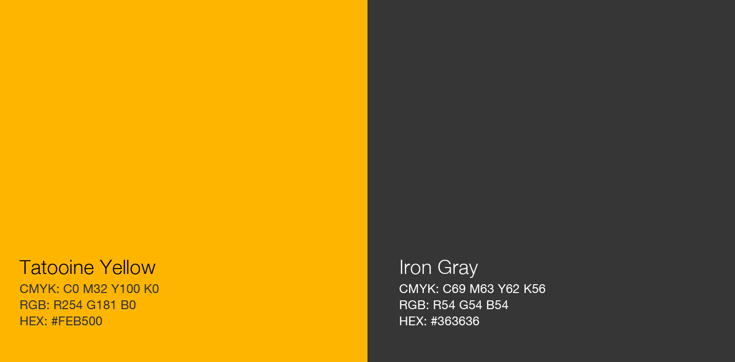
The color system consists of Tatooine Yellow (#FEB500) and Iron Gray (#363636). Yellow signals energy and distinctiveness at small scales, while Iron Gray references the company’s core material. The yellow’s name is an informal nod to the Star Wars desert planet, chosen for mnemonic and tonal contrast.
Typography
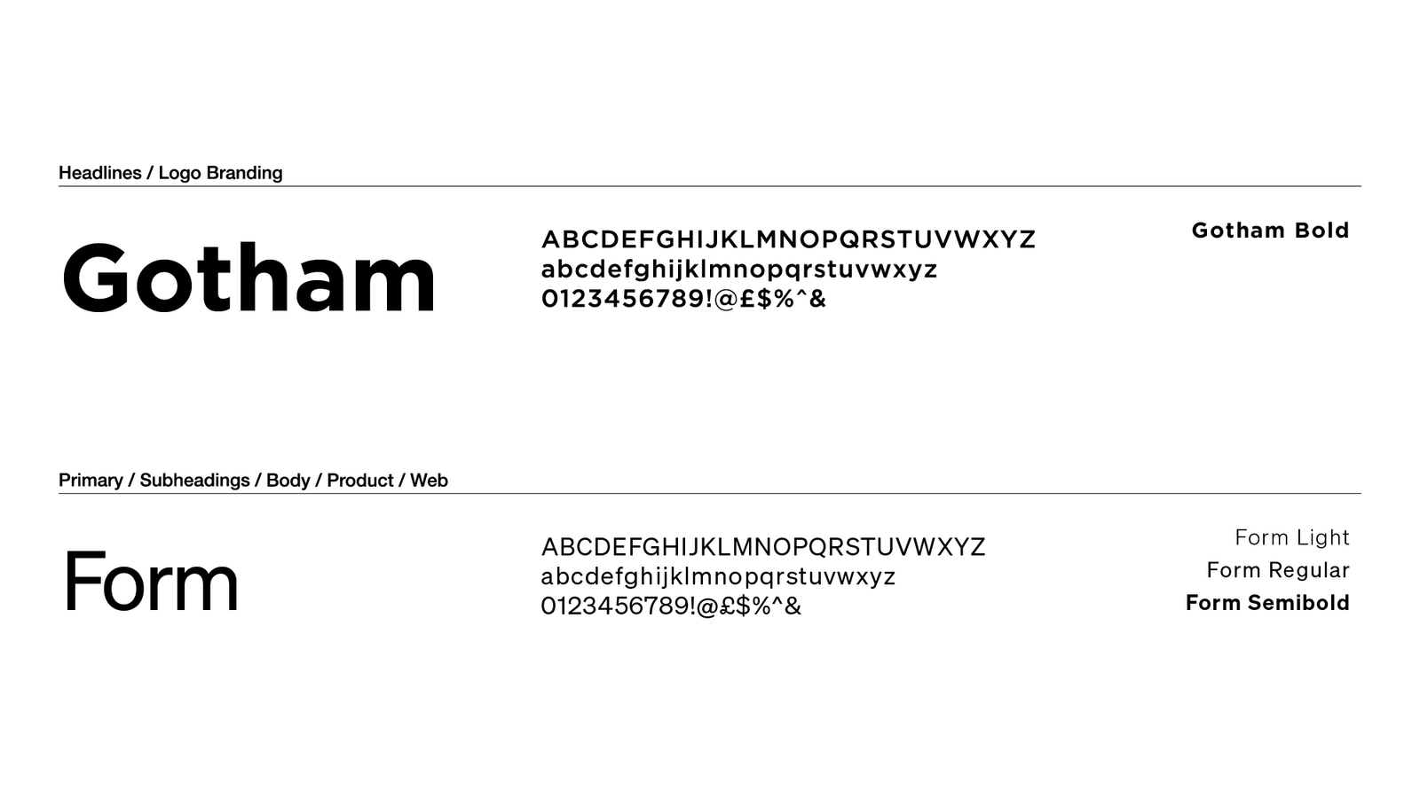
The primary typeface is Gotham HTF Bold. It provides geometric clarity and weight across print and screen. A secondary custom typeface, ‘Form,’ is derived from Akzidenz Grotesk and designed for technical readability. The Fe symbol was set in a refined type variant with balanced stroke and adjusted terminal structure.
Form.
A Custom Corporate Typeface
The Form typeface includes, Light, Regular, Semibold, and Bold.
Before
After
Get in touch...
hello@offlabel.design
offlabel | Vermont
Privacy Policy
