Blockbuster
Conceptual Brand Refresh
"Rewind the Magic"
Background
Once synonymous with movie rentals and Friday night entertainment, Blockbuster holds a special place in the hearts of millions. With the rise of streaming services, the brand now has an opportunity to make a triumphant return. This case study explores the creative process behind a conceptual refresh of the Blockbuster brand, combining 90s nostalgia with the convenience of on-demand streaming services, and giving the brand a functional, simple, and timeless identity.

The Challenge
Maintain historic brand equity while evoking nostalgia and positioning Blockbuster as a modern and forward-thinking streaming service. The refreshed brand needed to reimagine the iconic Blockbuster logo and visual identity for the streaming era while staying true to its roots.
The Solution
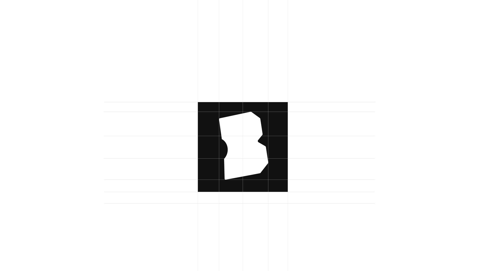
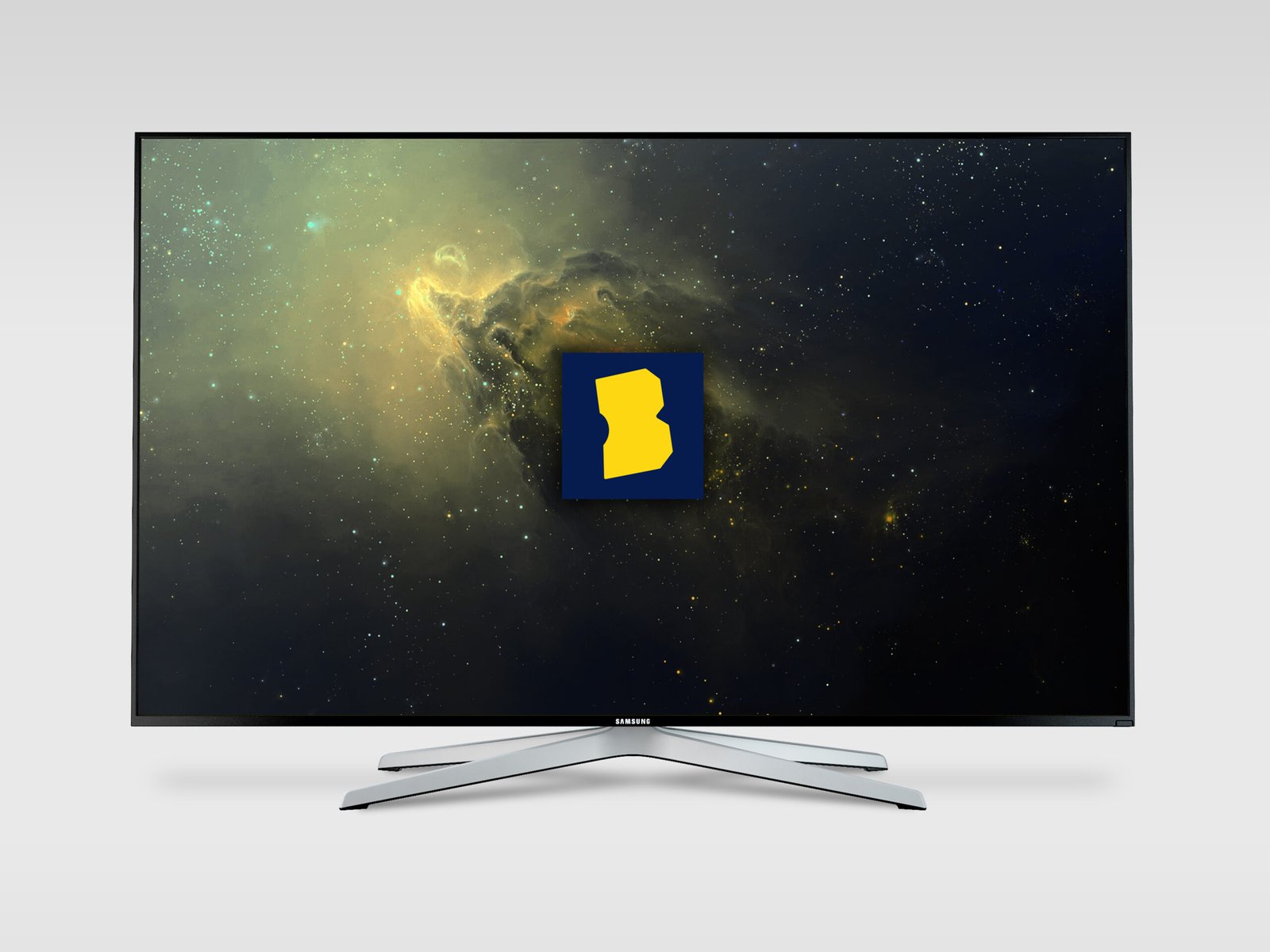
Icon: "B" (the Movie Ticket): Honoring Blockbuster's origins and maintaining a strong visual connection to the original brand, the letter "B" was transformed into a movie ticket symbol. By tilting and shearing the "B" at the same angle as the original Blockbuster logo ticket, the icon conveys motion, symbolizing progress and a fresh start. The enhanced triangle indentation at the front of the "B" represents the idea of "rewind," further connecting the new design to the brand's storied past.a
Color Palette
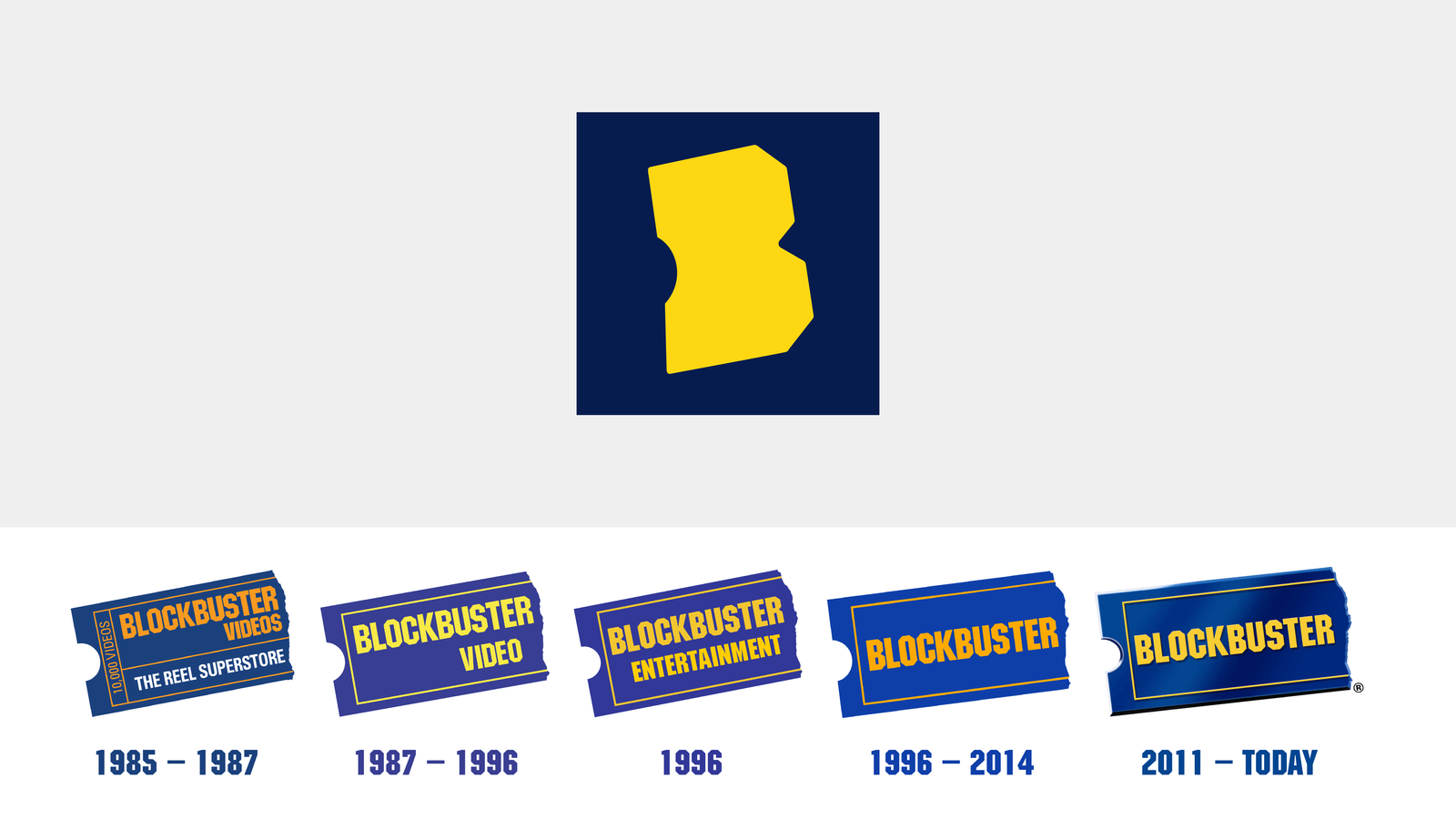
The Blockbuster brand has changed color palettes with each iteration. Why change the process? Going with a more understated, timeless color scheme, felt like it could fit in 1993 or 2023. The updated color palette maintains the iconic Blockbuster blue and yellow, evoking a strong sense of nostalgia while reinforcing the brand's identity
Brand Implementation
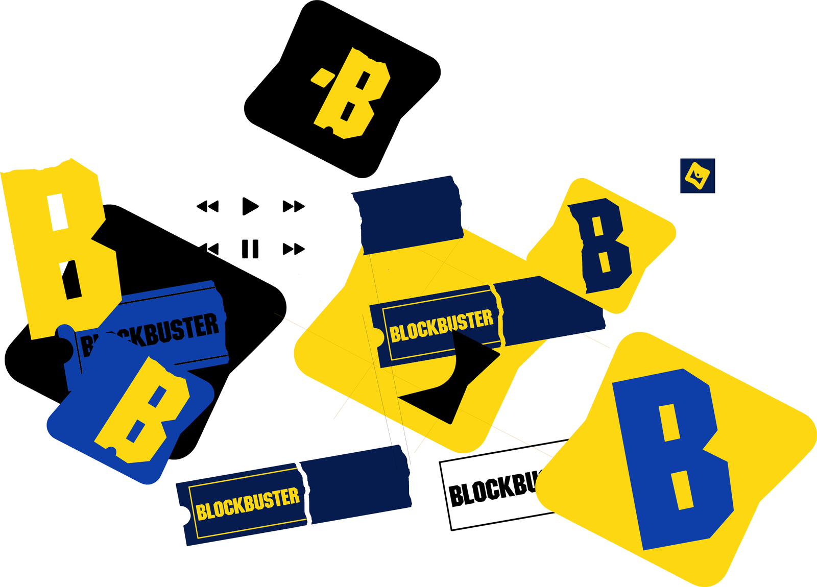
A comprehensive set of brand guidelines and assets was created to ensure a consistent visual identity across all touchpoints. From the streaming platform's user interface to promotional materials and social media, the new Blockbuster branding conveys a unified message of innovation, entertainment, and commitment to its loyal fan base.
Impact
The revitalized Blockbuster branding strikes the perfect balance between nostalgia and innovation. Simple and versatile, this identity pays tribute to Blockbuster's nostalgic past while positioning it for a successful future in the streaming industry. The iconic "B" movie ticket symbol, custom logotype, and vibrant color palette communicate a sense of excitement and anticipation, inviting viewers to embark on a journey through the world of film and television.
"Rewind the Magic"
I loved Blockbuster. Many nights were spent waiting for someone to come return a new release into the slot. What fun it is breathing new life into a beloved classic! By honoring its past, embracing its present, and looking toward the future, Blockbuster could reclaim its place as a household name and a go-to destination for entertainment lovers everywhere. Those who adored Blockbuster will find a brand that is both familiar and fresh, reflecting the company's commitment to delivering an exceptional and engaging entertainment experience. A successful branding refresh demonstrates that, with the right blend of creativity, functionality, simplicity, and timeless design, even a brand with a storied history can be revitalized and propelled into a new era of success.