Breville
A Brand Refresh Story
"That's the Idea."
Background
In the early 2000s, Breville, a renowned Australian-based small home appliance manufacturer, became a part of Housewares International Pty Ltd (HWI). With the acquisition complete, HWI aimed to expand its market reach and establish a strong Breville presence in North America.
To successfully enter the North American market, Breville needed to revamp its logo and visual language to appeal to a global audience. Collaborating with Phillip Ramsay and the international branding team, members of Anglo, and HWI Montreal, the development of a comprehensive global brand identity and strategy commenced.
Objective
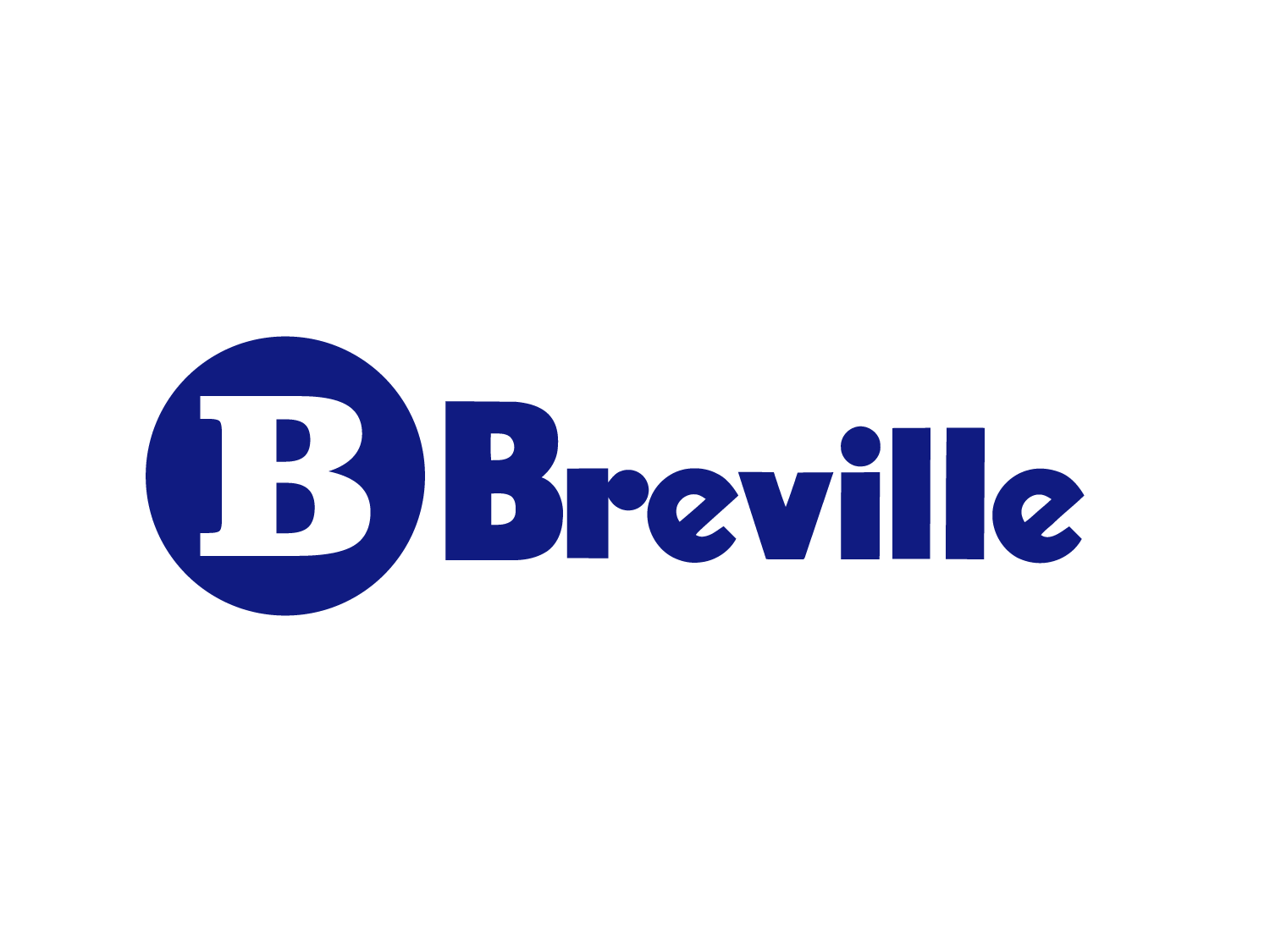
At the outset, the team concluded that the existing lockup (mark+logotype was outdated in its application. The logomark "B" should be not be reintroduced. The serif font of the encircled "B" was not supporting the sans-serif logotype.
Breville's existing logotype had significant brand equity, so the consensus was "less is more"
"Keep is Simple"
The Solution
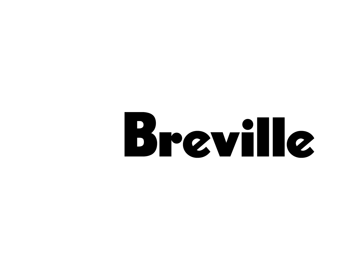
Variations and combinations of mark+logotype were introduced. The existing logotype was strong, functional across mediums, memorable, but lacked modernity. It was a classic car that needed some bodywork. The slightest variation in letterforms, most noticeably kerning, drastically changes the the feel of a logo. Simple satisfies.
Letterforms, Revisited
One notable letterform modification involved the narrowed and rounded hooks (terminals) on the lowercase 'e' and the hook of the lowercase 'r'. Another significant and arguably the most effective change was the implementation of positive kerning. Other subtle adjustments included modifications to the line-height, width, and weight.
These alterations not only enhanced the overall legibility but also amplified the visual appeal of the logotype, all while preserving the brand's unique character. The essence of the redesign lay in simplicity and meticulous attention to detail.
The refresh underscores the importance of carefully scrutinizing every aspect of a logotype or mark. Even the smallest choices can have a profound impact on forging a cohesive and potent brand identity. The finalized logotype, with its subtle refinements, retained the existing brand equity, remained memorable and distinctive, and above all, exuded modernity.
Web Development
As part of the brand refresh for Breville, a new website was launched to showcase the company's global initiatives and align with the updated visual identity.
Results
Simple, Functional, Memorable, Modern
The revitalized brand identity stayed true to historic brand equity and captured Breville's essence of innovation and high-quality home appliances.
© 2024