Organix
Lessons from a Brand Story
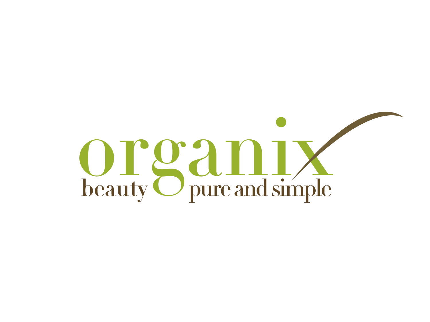
"beauty, pure and simple"
Brand designers work with a variety of clients, each with their own unique stories and missions, each a lesson, some bigger than others. This particular brand story underscores the importance of exercising due diligence before embarking on the design process.
Natural, Organic, Luxurious
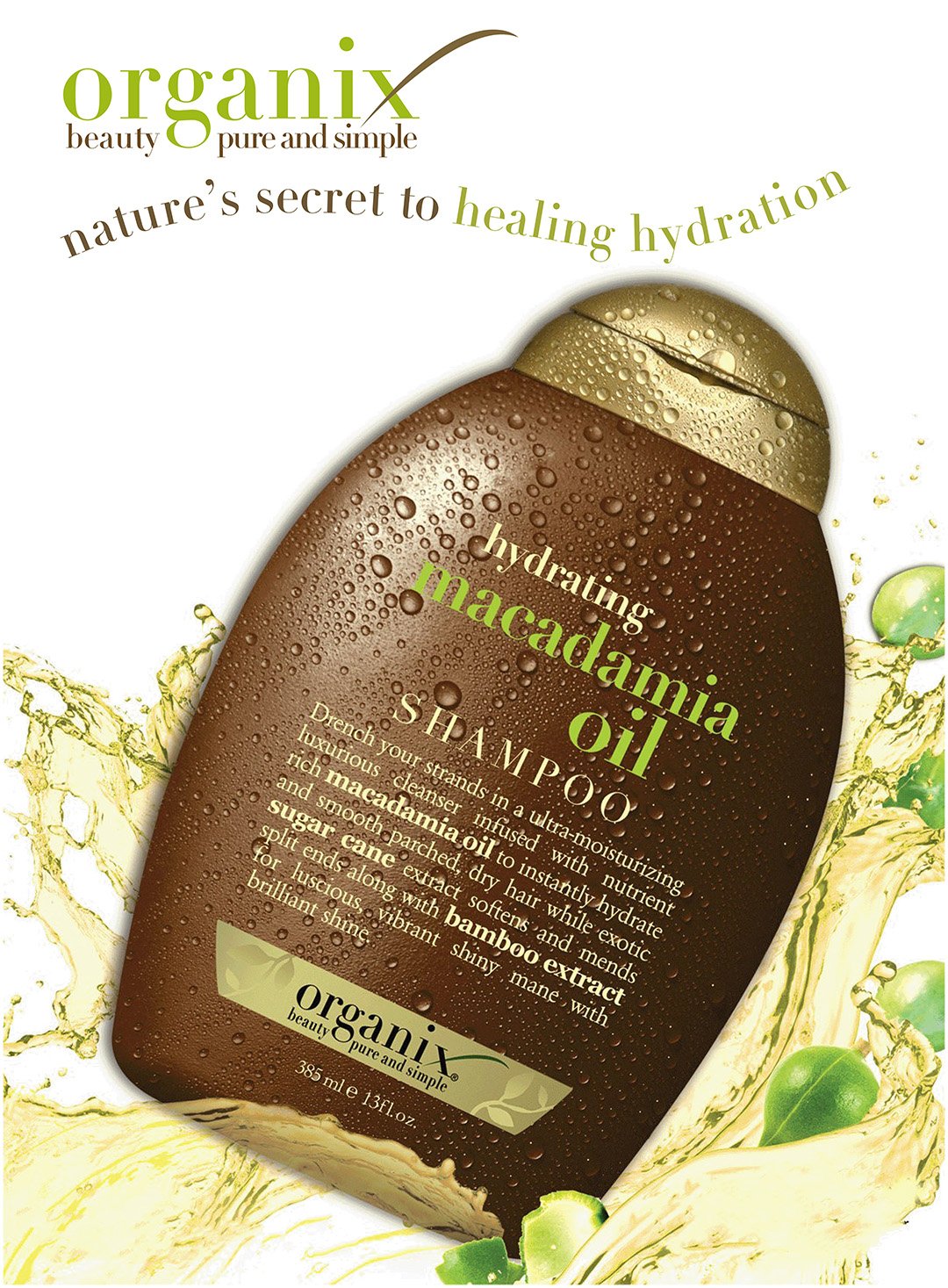
A logo that embodied Organix's commitment to hair care. The design themes were natural, organic, and luxurious. The target audience, GenX, consumers who prioritize natural ingredients, sustainability, and effective hair care solutions.
Design Elements
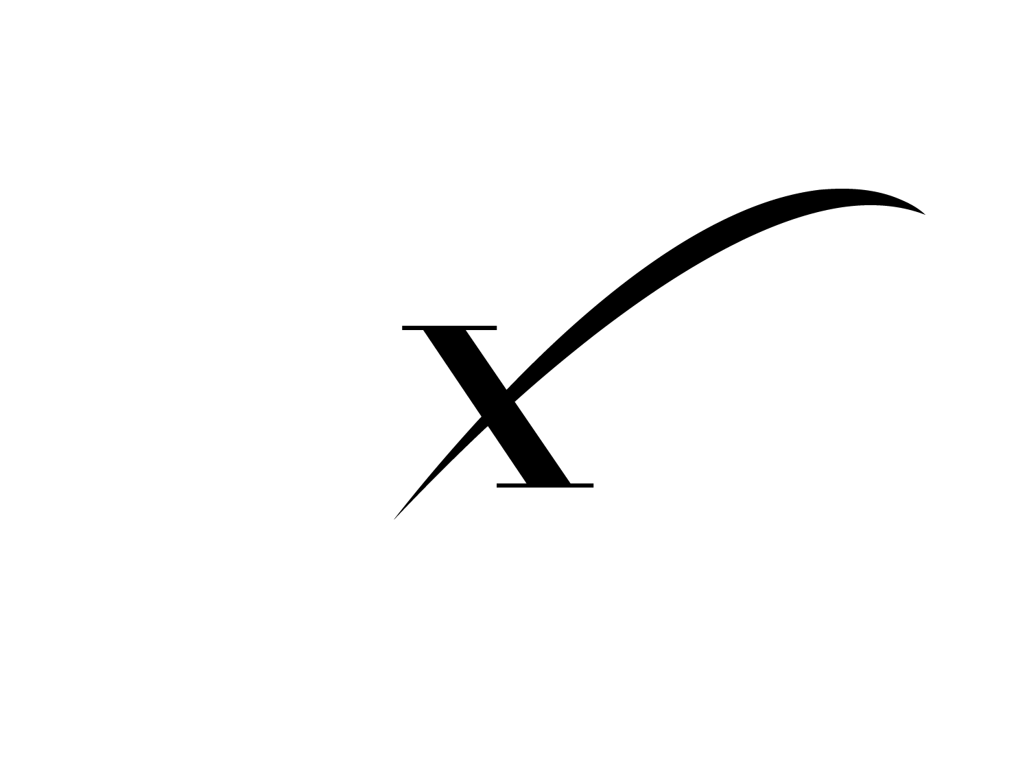
The lockup integrates the letter 'x' with a swoosh running through it, symbolizing crossing the boundaries of conventional hair care and embracing a more organic approach. The design was simple yet impactful. It would become memorable, but for all of the wrong reasons.

Color Palette for GenX
The color palette for Organix resonated within the Gen X demographic, those born between the mid-1960s and 1980. This generation holds significant purchasing power, accounting for 30% of wealth in the US. Their color preferences lean towards the basics, with a strong inclination towards organic touches.
Organic Green (#98B22D): This vibrant green represents growth, sustainability, and the connection to nature. This color aligns with Gen X's preference for nature-centric colors and their fondness for organic green, a color reminiscent of the avocado green appliances from the 1970s.
Earthy Brown (#6E5C37): This earthy brown hue evokes feelings of naturalness and authenticity. This color resonates with the Gen X preference for basic, organic colors like Sauteed Mushroom brown.
Generation X color preferences build on the basics from the previous generation and add in more nature-centric colors like greens, reds, and violets. The palette is characterized by brighter accents compared to boomers’ preferences, with a focus on colors like Golden Grass green, Cajun Spice red, and Heart’s Content pink.
The color choices for Organix were influenced by these preferences, creating a visual identity that resonated with Gen X.
Typography
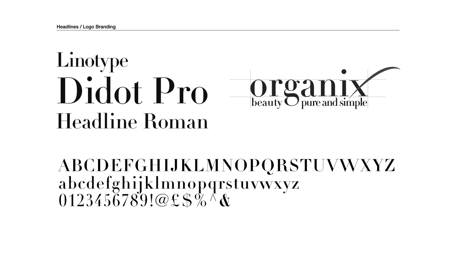
Linotype Didot Pro Headline Roman is a typeface that exudes a sense of sophistication and elegance. The choice of this typeface emphasizes elegance and Organix's presumed premium, high-quality hair care solutions.
In keeping with the brand's approachable and consumer-friendly ethos, the lowercase logotype created a sense of approachability and friendliness, making the brand feel more accessible and relatable to its target audience.
Beyond the Brief
Organix encountered significant legal battles over its organic labeling which would lead to a rebrand to eventual transfer of ownership. This brand story serves an important lesson; designers need to be aware not just of a client's brief, but also their product(s).
Despite the challenges, the original logo for Organix, now OGX, has endured. Johnson & Johnson, the current owner of the brand, has continued to keep elements of the original lockup, a testament to the strength and appeal of the design.
Due diligence and competitive intelligence should be central to any brand practice.
Get in touch...
hello@offlabel.design
offlabel | Vermont
Privacy Policy
