Breville
Rebuilding Breville’s Identity for Global Markets
"Modernizing a Legacy"
Background: From Humble Beginnings
Breville’s story began in 1932, when Bill O’Brien and Harry Norville combined their surnames to create the Breville brand. Originally focused on manufacturing radios, Breville quickly became a trusted name in Australian electronics. During World War II, the company shifted gears to produce mine detectors. After the war, with the rise of television, Breville transitioned to small kitchen appliances, leaving radios behind, a pivotal move that set the stage for decades of innovation.
In the 1960s, Breville opened its Research and Development Center in Botany, Sydney, under John O’Brien’s leadership. This hub became the birthplace of iconic products, including the Snack’n’Sandwich Maker in 1974, which revolutionized home cooking in Australia. Three years later, Breville introduced the Kitchen Wizz, Australia’s first food processor, which became a must-have in kitchens nationwide.
Breville’s success was driven by its focus on practical, user-friendly design, ensuring that everyday cooking became easier for consumers.
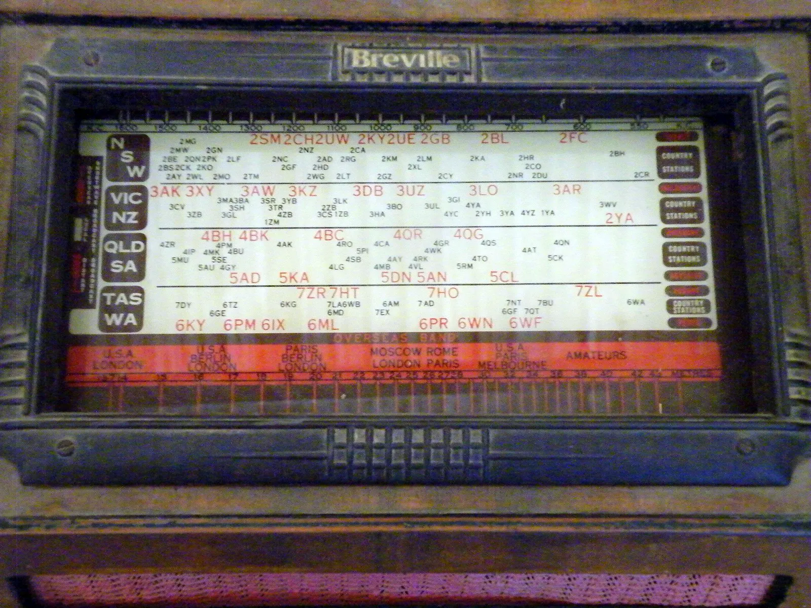
Pre-WWII Breville Radio: In 1932 Bill O'Brien and Harry Norville set up Breville Radio in Sydney.
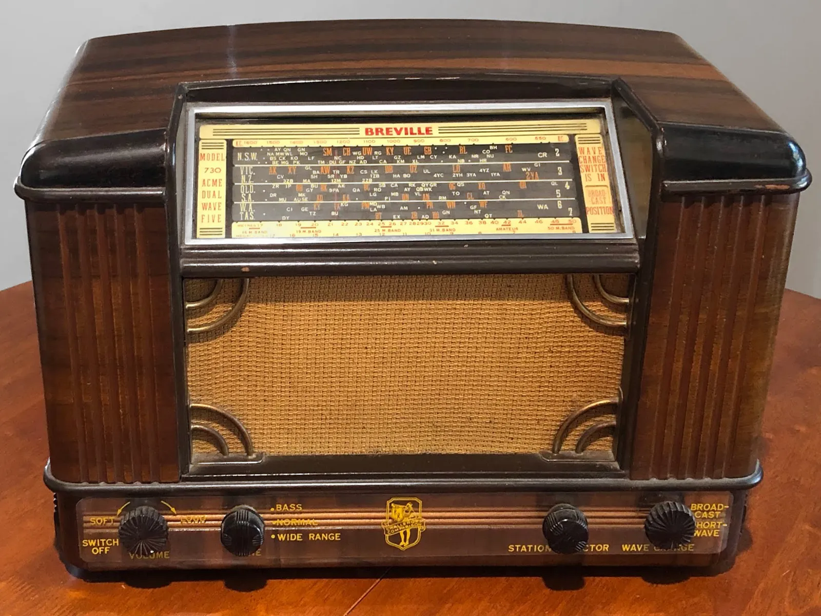
1940s Breville Radio: It was a near-instant success, outgrowing two factories before World War Two intervened.
The Problem: Outdated Visual Identity
By the early 2000s, Breville’s “B” logomark, in use since the 1960s, no longer supported the company’s evolving product ecosystem. My focus: improving its legibility and adaptability across print and early web. While the mark remained effective in Australia and New Zealand, it lacked flexibility for digital applications and global markets, especially in the competitive North American landscape.
The original “B” logo, which had been a mainstay of Breville’s identity from the 1960s until the end of the 90s.
The 2002 Brand Refresh: Breville’s New Global Identity
In 2001, Housewares International Limited (HWI) acquired Breville, giving the company the resources to expand in North America. At that time, Breville’s “B” logomark had been effective in Australia and New Zealand but needed an update to suit a global audience. The success of the 2002 refresh? A reliable fax machine, a good DSL modem, and a global team, with design input from Montreal, Anglo Canadian, and HWI. The result was a modernized visual identity that preserved Breville’s heritage and positioned it for growth across diverse markets.
Grey overlay shows refined adjustments to the letterforms, including tweaks to spacing, kerning, and proportions, giving the logo a cleaner, more modern look.
Logo Refinements: Modernizing a Classic
As part of the brand refresh, I worked on refinements to the existing logotype. The logotype had brand equity in previous markets but lacked that elusive je ne sais quoi. After sketching out every idea from stakeholders, many on the team found the existing logo wasn't broken, but needed a little TLC.
By subtlly adjusting proportions, refining letterforms, and optimizing spacing, the logotype could breathe. It worked well across digital and product, large or small. The changes in kerning and stroke weight improved readability and gave the design a smoother, more modern feel.
The result? A cleaner logotype, debuting in Breville Blue, which later became their signature purple.
Before::After
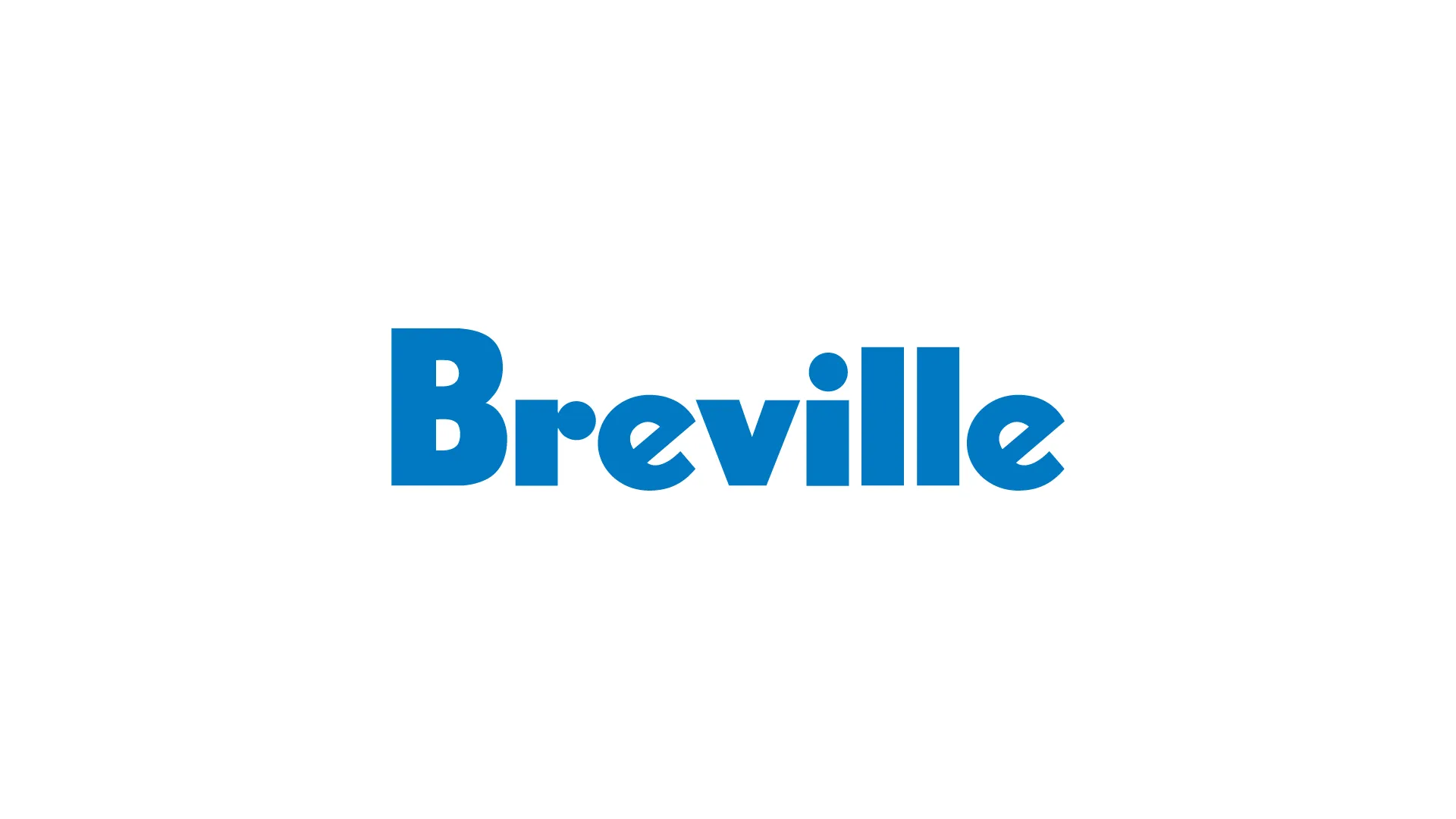
2002 Breville Blue
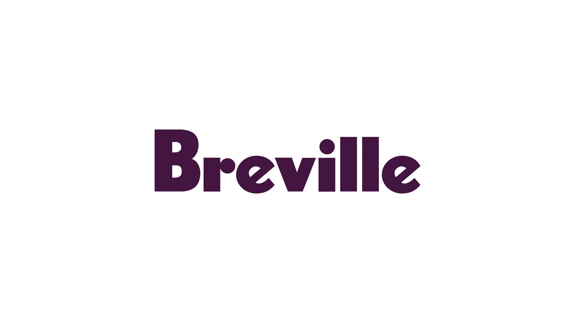
Present Day Purple
Letterform changes
The North American Launch: A Global Effort
In January 2003, Breville entered the North American market at the International Housewares Show in Chicago, showcasing its refined logo and a lineup of innovative products. The Juice Fountain™, with its ability to juice whole fruits and vegetables, was a standout at the event, capturing attention alongside a range of espresso machines. Both products tapped into rising health trends and the demand for premium home appliances.
This launch helped Breville quickly get noticed in a market dominated by big names like KitchenAid. Retailers were drawn to the brand’s practical innovations and premium appeal.

The Breville Juice Fountain™
The 2002-2003 website launch introduced Breville’s updated identity to global audiences.
Web Development
Breville updated the company’s visual identity to support its global expansion into new markets. This marked a significant step in Breville’s digital transformation, as the website was invaluable in introducing the brand to North American and international audiences.
1. Showcasing Global Initiatives: Breville’s new website highlighted the company’s innovative product line.
2. Visual Identity Alignment: The website embraced Breville’s new visual identity, incorporating the updated logotype and the introduction of Breville Blue (which later evolved into the brand’s iconic purple).
3. User Experience Enhancements: Designed with early 2000s web capabilities in mind, the website prioritized ease of navigation and product discovery.
4. Localized Content for Global Reach: The website was adaptable to different markets, providing localized content for regions like North America, Europe, and Australia.
5. E-commerce Integration (2002): While e-commerce was still developing in 2002, Breville’s new website included early-stage shopping functionality that supported product exploration and led users to purchase points.
A Lesson in Design: Simplicity and Detail
Working on the Breville refresh early in my career taught me the impact of subtle, precise typographic changes. I learned the importance of scrutinizing even the smallest details in a logotype design. Subtle changes, such as kerning and letterform adjustments, make a profound impact on how a brand is perceived. The finalized logotype retained Breville’s existing brand equity while remaining simple, distinct, memorable, and, most importantly, modern.
A word for new designers:
To truly grow in this craft, know type intimately! Start by getting hands-on: sit down with a pencil, and copy letterforms from classic typefaces. Pay close attention to the subtle differences in curves, the thickness of strokes, and the negative spaces within and between letters. This practice builds a sensitivity to type that software can’t teach. Typography is a discipline of precision, where every small decision contributes to clarity and tone.
Make a habit of drawing letters by hand, studying not just how they look but how they feel. Learn from historical typefaces, observe how each element affects readability and structure, and incorporate these insights into your own work.