A logo distills a brand’s essence into a singular, powerful form. It’s the first impression and the lasting connection. A great logo is timeless, outlasting trends and becoming a constant symbol. Through simplicity and symbolism, it captures and defines the brand’s identity.
Q. How do you create a logo that captures a brand’s essence and stands the test of time?
A. It’s about answering the right questions and staying true to core design principles.
Does your logo have...
Relevance and Meaning:
Suitable: Does your logo align with the brand's identity, message, and target audience?
- FedEx's logo (1994) incorporates a hidden arrow between the ‘E’ and ‘X,’ symbolizing speed and precision—core qualities of the brand.
FedEx Logo (1994) Designed by Lindon Leader at Landor Associates.
Meaningful: Does your logo carry a deeper meaning or symbolism relevant to the brand?
- Amazon's logo (2000) an arrow from 'A' to 'Z', symbolizing that they offer everything from A to Z.

Amazon Logo (2000) the fourth version of the Amazon logo Designed by Turner Duckworth
Simplicity and Clarity:
Simple: Is your logo recognizable and understood at a glance? Can you walk away and sketch it on a napkin or draw it in the sand?
- Apple's simple bitten apple (1998) is a universally recognizable symbol.
Apple Logo (1998) Apple introduced the monochrome logo in 1998, replacing the rainbow stripes.
Legible: For text-based logos, legibility is crucial. Is your typography clear and easy to read?
- Google's simple wordmark (2015) is clean, readable, and instantly recognizable. The 2015 Google logo was designed by Google’s in-house design team.
The 2015 Google logo was designed by Google’s in-house design team.
Clear: Does your logo convey the brand's essence without requiring extensive analysis?
- Target's bullseye logo (1962) is aligns with the brand's name and mission to be the go-to destination for shoppers.
Target Logo (2018) Designed by Target’s in-house team, the bullseye remained unchanged while the wordmark switched to lowercase, giving the logo a friendlier feel.
Distinctiveness and Memorability:
Distinctive: Does your logo set the brand apart from competitors and is unique in its design?
- Nike's swoosh (1971) is iconic and unique in its field.
Nike Logo (1995) By 1995, Nike’s swoosh, designed by Carolyn Davidson in 1971, became so iconic that the brand dropped the wordmark, letting the swoosh stand alone as its symbol.
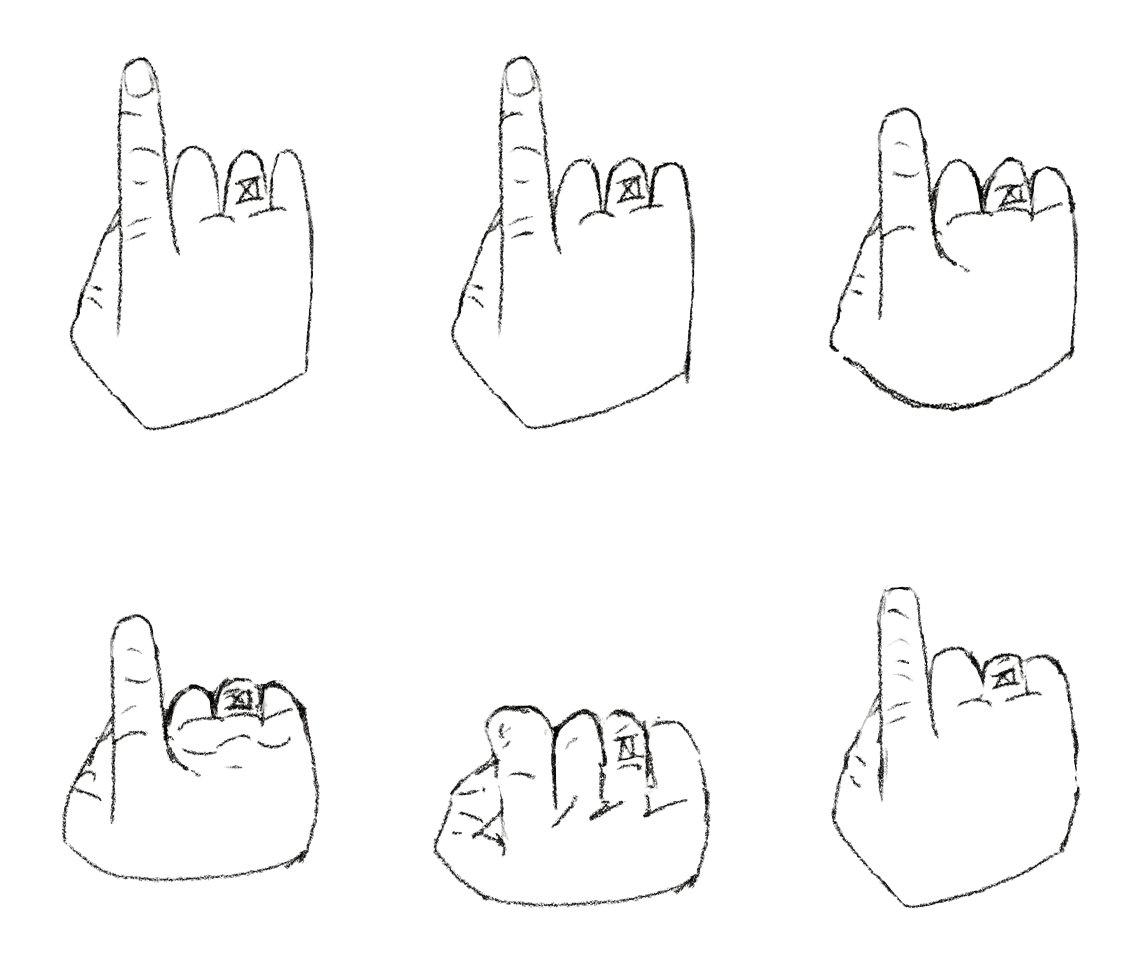
Memorable: Does it leave a lasting impression on the viewer? Again, can you draw it with your finger in the sand? Can you glance at it, walk away, and sketch it?
- McDonald's golden arches (1961) are unforgettable and recognized globally.
McDonald’s Golden Arches (1968)
Designed by Jim Schindler, this version of the Golden Arches logo evolved from the original 1962 design, incorporating the physical arches into the now iconic “M” symbol recognized globally.
Adaptability and Scalability:
Adaptability: Can your logo can be adjusted or updated to accommodate changing market trends or brand evolution? You might want to avoid gradients!
- Starbucks has subtly and adaptively updated its siren logo (1971) over time to keep it fresh while staying on-brand.
In 2011, Starbucks redesigned its logo to focus solely on the Siren. The updated logo removed all other elements, allowing the Siren to stand alone as the face of the brand, emphasizing simplicity and global recognition.
Scalability: Can your logo be used on any medium, large or small? Do they catch it on the billboard as they zoom by at 70 mph? Can you see it on a golf ball sitting on a tee?
- Adidas' three stripes (1949) work equally well scaled on a shoe as they do on a billboard.
Adidas Logo (1991) The Three Bars logo, introduced in 1991, symbolizes a mountain representing athletic challenges. In its current form, Adidas has removed the wordmark, letting the bars stand alone as the brand’s primary logo for performance products.
Culturally Aware and Inclusive:
Aware: Is your logo sensitive to different cultural backgrounds and values, ensuring it resonates with diverse audiences?'
- Unilever’s logo (2004), designed by Wolff Olins, uses 25 icons to represent the company’s diverse business areas, creating a symbol that resonates across cultures while promoting sustainability and inclusivity.
Unilever’s logo (2004), designed by Wolff Olins, uses 25 icons to represent the company’s diverse business areas, creating a symbol that resonates across cultures while promoting sustainability and inclusivity.
Inclusive: For global brands, does your logo transcend cultural barriers and appeal internationally?
- UNICEF's inclusive mother and child emblem (1946) resonates globally, transcending cultural barriers.
UNICEF Logo (1960s) The emblem, showing a mother lifting a child, symbolizes care and protection, resonating globally and transcending cultural boundaries
Timelessness:
Does your logo remain relevant and effective across different eras, enduring design trends? If you've satisfied the previous qualities, then it just might!
Remember, there are particular aspects of timelessness, whether it's enduring luxury (Mercedes-Benz - 1926), consistent branding over a long history (Coca-Cola - 1886), iconic simplicity (Apple - 1977), or global recognizability (McDonald's - 1961).
Timelessness is the reward for a logo that captures a brand’s essence, outlasts trends, and embeds itself in the collective memory. It’s a logo that people can see, remember, and experience.
In lines and colors, in harmony of form and meaning = a path to timelessness.
Final Thoughts
A logo should be simple, clear, and work in any context.
It’s not decoration! It's capturing a brand in a single form.
A great logo leaves no room for confusion. It speaks clearly, works everywhere, and stays with you.
When it’s done right, it is inseparable from the brand itself.
Design with purpose, and the logo will do the rest.
Handle your work with care, creativity, and conviction.
Remember, a brand is a terrible thing to waste.
