Park International Hotel
Brand Refresh, Print, Signage
"Experience Elegance, Embrace Luxury"
Background
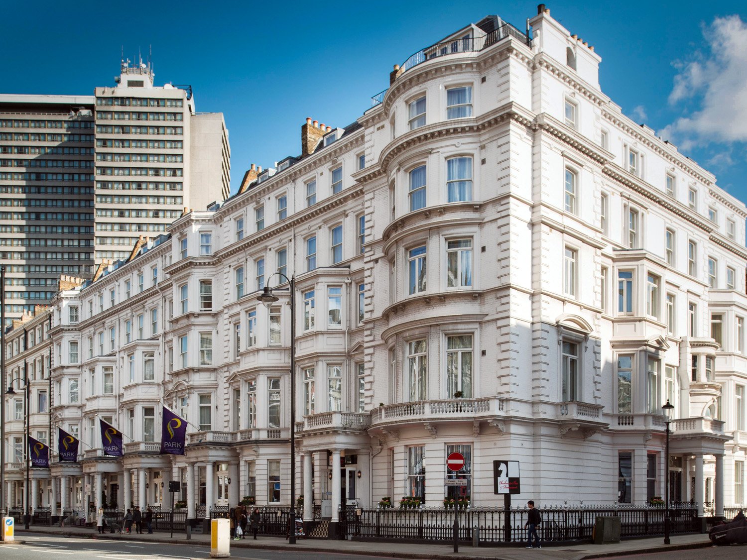
Park International Hotel, with 171 fully-furnished rooms and suites, caters to a wide range of guests, from solo travelers to families and groups. The hotel combines the comforts of home with the luxury of high ceilings, modern decor, and convenient amenities. Situated just steps away from iconic landmarks such as the Royal Albert Hall, the Victoria and Albert Museum, and the world-renowned Harrods, Park International Hotel offers a unique blend of contemporary comfort within a heritage building.
In 2012, I had the privilege of creating the original logo for Park International Hotel. The brand has gained significant brand equity, but it's essential to periodically reassess and reinvigorate brand identities to remain attuned to shifts in the sector. My initial design leaned entirely modern. Now that the brand has long established itself it deserves a classic (established) feel.
BEFORE AND AFTER
The Brand Refresh
The new brand refresh strategy and identity needed to be modern and classic, reflecting the hotel's unique location, offering guests easy access to luxury fashion brands, eclectic shopping, artistic enrichment, and quiet contemplation in Hyde Park.
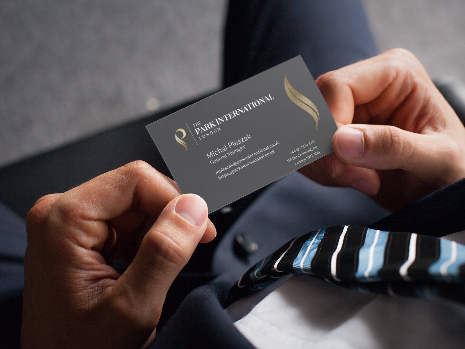
Using the initial logomark (to maintain brand recognition and equity), the logo refresh features a slight sizing modification to the stylized “P,” but changes the logotype to become serif-centric. It should reflect Park International Hotel's commitment to providing world-class style across rooms and decor. The resulting lockup is both classic and modern and can be displayed horizontally or vertically.
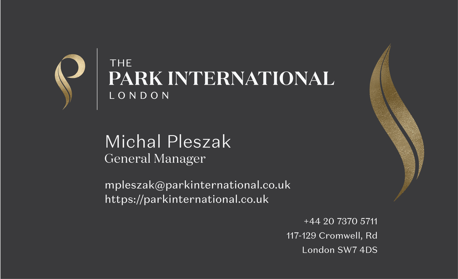
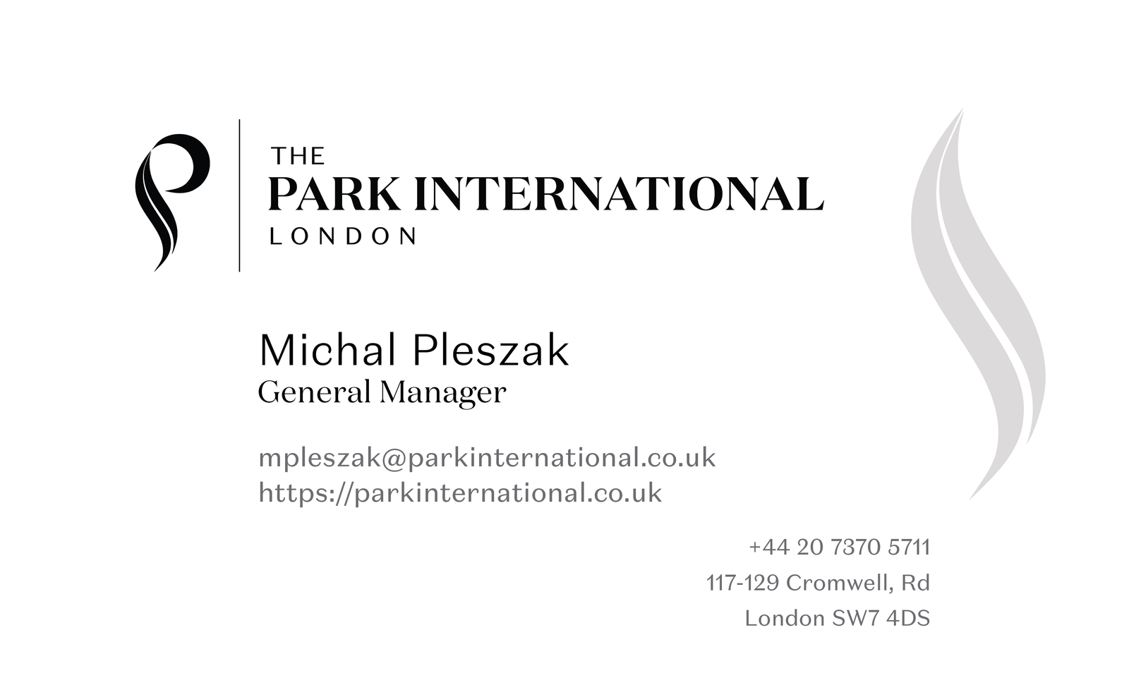
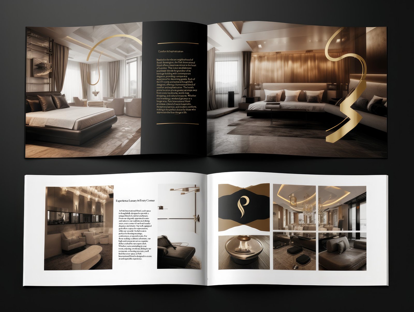
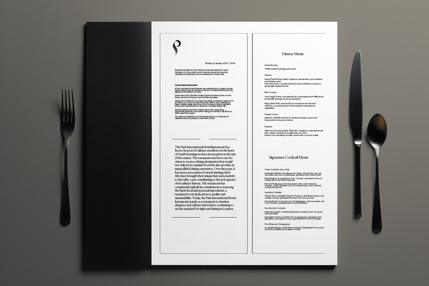
The Collateral
A comprehensive collection of design collateral, including brochures, cards, signage, and a brand guideline document were developed for the refreshed identity.
The new brand strategy and identity for Park International Hotel positions it as a premium choice for business and leisure travellers who know exactly what they want.
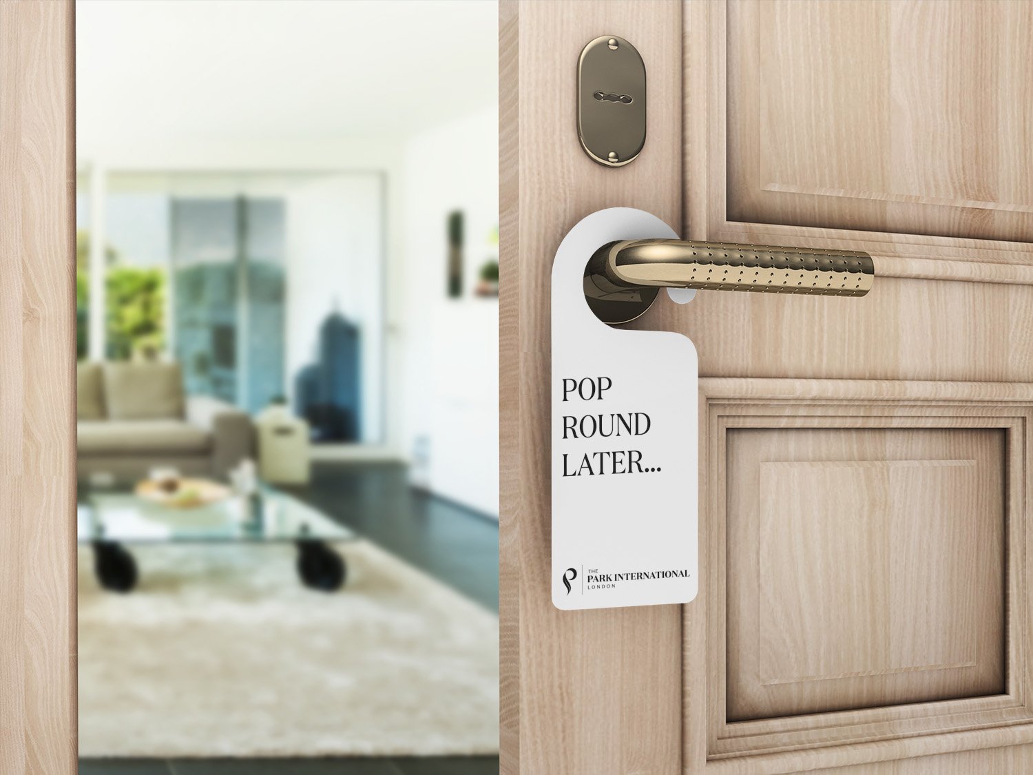
"Pop Round Later..."
In the recent rebranding effort for Park International Hotel, a distinctly British expression, "Pop Round Later," was chosen to replace the traditional "Do Not Disturb" sign. This creative decision underpins a strategic commitment to intertwine the quintessential London experience into every facet of the hotel stay, even down to the smallest detail. The choice to use localized vernacular is not just about setting the hotel apart, but also about curating an authentic, culturally rich experience that resonates with guests. It's about taking the ordinary and making it extraordinary, bringing a unique charm that is memorable, unexpected, and quintessentially London. It exemplifies the deliberate and thoughtful consideration given to every aspect of the brand refresh.
© 2024